
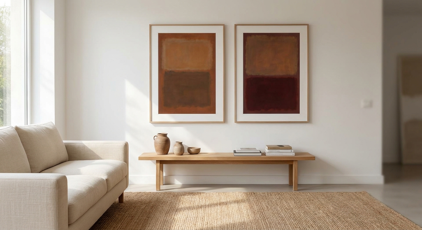
Mark Rothko's soft-edged colour blocks are the shorthand for a calm, considered room in 2026, and getting the look right in a minimalist home comes down to palette restraint, scale, and how much frame you're willing to live with.
- Mark Rothko prints work in minimalist rooms only when limited to 2-3 tones and hung large — busy multi-colour versions read as office art.
- Gioia's large canvas prints suit feature walls over 1.5m wide; verdict: Buy for a bare living room wall.
- Round canvas wall art softens the hard rectangle of a classic Rothko-style piece; Consider it for Japandi corners.
- Skip anything under 60cm with more than three colours — it loses the calm, meditative effect Rothko is known for.
- Somewhere Between, an original abstract canvas from Gioia, is a genuine alternative to a Rothko-style print; Consider for one-of-one buyers.
Why This Matters
Rothko's colour-field paintings are built on restraint — two or three tones, no linework, no narrative. That's exactly the visual language minimalist interiors already speak, which is why Rothko-style prints keep turning up in Scandi and Japandi living rooms across Australia in 2026.
The catch: not every print sold under the Rothko name actually behaves like a Rothko. A lot of mass-produced versions crank up the saturation or crowd in extra colours to look more "finished," which defeats the entire point in a stripped-back room. Gioia's curated wall art prints are picked with that restraint in mind rather than by colour count alone.
Getting this pick wrong is expensive to fix — a 180cm canvas isn't something you swap out on a whim once it's on the wall.
Who Mark Rothko Prints Are For
This guide is for someone finishing a Scandi, Japandi or Coastal Luxe living room, bedroom, or hallway who wants one calm anchor piece instead of a gallery wall of smaller frames. You've probably already got a neutral base — off-white walls, timber tones, maybe a boucle sofa — and you need a single large piece that adds mood without adding visual noise. If you're drawn to Rothko because you want something quiet rather than something that says "look at me," you're the right buyer for this style.
What to Look For in Mark Rothko Prints for Minimalist Interiors
Palette Restraint Over Colour Variety
Rothko worked in tight tonal families — maroon over black, ochre over cream, deep blue over grey. In a minimalist room, matching that discipline matters more than matching the exact painting. Stick to two or three tones that sit within your existing colour scheme, or the print becomes the loudest thing in the room instead of the calmest.
Scale Before Detail
Colour-field work has almost no linework to reward a closer look, so it needs size to earn its wall space. A 40cm x 50cm print reads as a swatch, not a mood. For a queen bed wall or a living room feature wall, aim to fill 60-75% of the furniture width beneath it — that usually means 120cm or wider.
Frame Choice, or No Frame at All
Minimalist rooms generally favour a gallery-wrap canvas with no frame, letting the colour run to the edge of the piece. If you do want a frame, keep it thin — raw timber or matte black — never an ornate or gilt edge, which fights the whole point of the style.
Print Depth and Colour Fidelity
Rothko's canvases rely on layered glazes that shift subtly across the surface. A flat, single-tone poster print loses that entirely. Look for giclee-grade reproduction with visible tonal gradation rather than a hard colour block — banding is obvious and unforgiving at large sizes.
Wall and Light Placement
Colour-field pieces genuinely change mood with the light in the room across the day. Keep them out of direct western sun, which fades and warms the perceived tone over time, and leave at least 40cm of clear wall around the edges — a Rothko-style piece crowded by shelving or furniture reads cluttered instead of calm.
Top Picks for Minimalist Rothko-Style Walls
The Statement Canvas — the safe pick for a bare living room wall. A large, unframed colour-field canvas is the pick that does the most work with the least fuss. Gioia's large canvas prints collection runs up to 200cm across, which is wide enough to read as a single mood rather than a poster stretched too far. Verdict: Buy if you have a bare wall over 1.5m and want one piece, done.
The Framed Gallery Piece — the wildcard for a layered wall. If you're mixing a Rothko-style piece into an existing arrangement rather than hanging it solo, a thin-framed version anchors the grouping without competing with smaller works around it. Keep the frame under 3cm deep and matte, not glossy. Verdict: Consider for gallery walls, Skip if this is meant to stand alone.
The Round Canvas Reinterpretation — the pick for softer, Japandi-leaning corners. A circular colour-field canvas takes the calm of Rothko's palette and drops the hard rectangle, which suits a reading nook or a rounded console corner better than a straight wall segment. Verdict: Consider for smaller or curved spaces where a big rectangle would feel heavy.
The Original Abstract Alternative — skip the reproduction, buy an original. If a licensed reproduction doesn't sit right with you, an original abstract canvas in the same tonal, textured mood is the more honest buy. Verdict: Consider for anyone who wants a one-of-one piece over a print run.


What to Avoid
- Small, busy "Rothko posters" under 60cm. They compress the tonal layering into a flat block and end up reading as generic office decor, not calm colour-field work.
- Ornate or gilt frames. They pull focus straight to the frame instead of the colour, which is the opposite of what a minimalist room wants.
- High-gloss laminate finishes. Glare across a large colour-field canvas breaks the matte, moody effect that makes the style work in the first place.
Verdict Comparison
| Pick | Best For | Format | Verdict |
|---|---|---|---|
| Large statement canvas | Bare feature wall, living room | Unframed, 150cm+ | Buy |
| Framed gallery piece | Layered or gallery walls | Framed, thin edge | Consider |
| Round canvas | Japandi corners, reading nooks | Circular canvas | Consider |
| Original abstract painting | One-of-one collectors | Original on canvas | Consider |
FAQ
What makes a print "Rothko-style" rather than a real Rothko print?
A Rothko-style print borrows his tonal, colour-field approach — two or three layered tones with soft edges and no linework — without being a licensed reproduction of an actual Rothko painting. Most pieces sold for home decor in 2026 fall into this category rather than being gallery-authorised prints.
Are Mark Rothko prints good for small rooms?
Yes, if you scale down the piece rather than the palette. A smaller room still needs a piece that fills 60-70% of the wall segment above the furniture, just at a smaller absolute size than a large living room would need.
What size Rothko print works above a sofa?
Aim for a canvas at least 120cm wide for a standard three-seat sofa, or wider if the sofa runs past 200cm. Anything smaller reads as a swatch rather than a statement piece.
Should Rothko-style prints be framed or unframed?
Unframed, gallery-wrap canvas is the more common minimalist choice for 2026 interiors because it lets the colour run to the edge. A thin frame works if the piece sits inside a mixed gallery wall rather than standing alone.
How much does a large abstract canvas cost in Australia in 2026?
Original abstract paintings in this style range from roughly $370 to $1,200 for smaller and mid-size canvases, with larger statement pieces costing more depending on size and artist.
What colours work best for Rothko prints in minimalist interiors?
Stick to two or three tones already present in your room — warm neutrals with a single deep accent like maroon or navy, or cool greys with an ochre or blue layer. Avoid pieces with four or more competing colours.
Can Rothko-style prints go in a bedroom?
Yes, and it's one of the most common placements — above the bed on the wall directly behind the headboard, centred on the furniture rather than the wall itself.
Is a round canvas a good alternative to a classic Rothko rectangle?
It works well in curved or awkward corners where a large rectangle would feel heavy, though it loses some of the horizon-line effect that makes rectangular colour-field work so calming.
One Last Thing
The most common mistake in 2026 room reveals isn't the print itself — it's the hanging height. Buyers centre the piece on the wall rather than on the furniture beneath it, which leaves it floating too high above a sofa or bed. Centre the artwork 15-20cm above the top of the furniture, not the middle of the wall, and a Rothko-style canvas will sit the way it's meant to: like it was always part of the room.


