
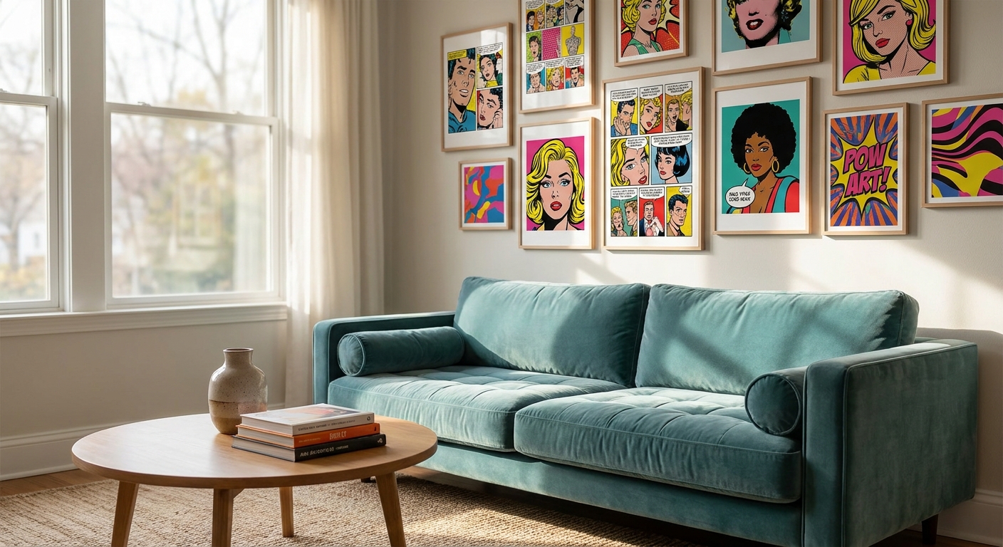
Pop art wall prints turn a plain wall into a statement in seconds, and 2026's colour-hungry interiors are leaning hard into that punch. This guide breaks down what actually works for bold, saturated rooms versus what just looks loud in a showroom photo.
- Pop art wall prints work best as one accent piece, not scattered across every wall in a room.
- Pablo Picasso prints for eclectic homes are the safest entry point for first-time bold buyers in 2026.
- Kandinsky prints for vibrant abstract interiors suit rooms that already run a saturated colour palette.
- Skip pastel 'pop-lite' prints in 2026 — they read as decor, not statement, and lose impact fast.
- Canvas holds colour better than paper posters under direct Australian sun through summer 2026.
Why this matters
Bold colour in interiors isn't a trend that quietly faded after 2023 — it's the dominant note in 2026 living rooms, home offices and rental refreshes across Australia. The problem is that most people buying pop art wall prints for the first time either go too safe (a print so muted it barely registers as pop art) or too loud (a wall that fights with the sofa, the rug and the light fitting). Gioia Wall Art works with interior stylists who see this mistake constantly: the print is right, the sizing and placement are wrong. Get those two things right and pop art wall prints do the heavy lifting a whole room's styling usually needs.
Who this is for
This guide is for anyone furnishing a home that already leans maximalist, or anyone bored of beige walls and ready to commit to colour in 2026. Think renovators with a fresh feature wall, first-home buyers who want personality without a full renovation budget, and share-house tenants who need a piece that travels with them. It's also for anyone who has bought one "safe" abstract print already and wants the next piece to actually say something. If your palette is currently neutral-on-neutral, pop art wall prints are the fastest way to shift a room's whole personality without touching paint or furniture.
What to look for in pop art wall prints for bold, colourful homes
Colour saturation, not just colour
A print can technically be "colourful" and still fall flat if the saturation is muddy. Look for prints where the colour blocks are pure and high-contrast — the kind of red, yellow and cobalt that pop art built its reputation on since Warhol and Lichtenstein. Muted or dusty versions of the same palette lose the graphic punch that makes pop art recognisable from across a room.
Scale relative to your wall
A 40cm x 40cm print on a 3-metre wall reads as an afterthought, not a statement. For a genuine feature wall, aim for a single piece that covers at least 60% of the available vertical space, or commit to a gallery grouping that fills the same footprint. Undersizing is the single most common mistake buyers make with bold prints.
Print finish and material
Canvas prints handle bold colour better than framed paper prints in rooms with strong natural light, because canvas absorbs light differently and resists the washed-out look paper can develop over a few years. If the wall gets direct afternoon sun, factor that into your material choice before you factor in the image itself.
Subject matter that won't date
Classic pop art references — comic-strip panels, screen-print portraiture, bold geometric abstraction — age better than niche meme-driven graphics. A print inspired by mid-century pop art movements still reads as intentional in ten years; a print chasing a 2026 internet trend usually doesn't.
Framing decisions
Unframed canvas suits a maximalist room where the print itself is the focal point. A slim black or white frame works when the print needs to visually separate from a busy gallery wall behind it. Heavy ornate frames almost always fight with pop art's graphic simplicity — skip them.
How it sits with existing colour
Pop art wall prints don't need to match your sofa, but they do need at least one shared colour note with the room to avoid looking like a random addition. Pull one dominant hue from the print and echo it in a cushion, a vase or a rug edge.
Top picks for bold, colourful rooms in 2026
Pablo Picasso prints for eclectic homes — the safe pick. Cubist colour blocking gives you bold shapes and saturated tone without full pop-art irony, which makes it easier to live with long-term. It works in rooms with existing patterned textiles because the fractured forms don't compete for attention the way a single bold portrait does. If you're nervous about committing to a loud wall, Pablo Picasso prints for eclectic homes are the lowest-risk entry point. Buy.
Kandinsky prints for vibrant abstract interiors — the colour-theory pick. Kandinsky's compositions use up to six or seven distinct hues in one canvas, which is more than most pop art references attempt, and it rewards rooms that already run a saturated palette rather than a single accent wall. This is the pick for a room where the sofa, the rug and the art all get to be loud together. Try Kandinsky prints for vibrant abstract interiors if your whole space is already committed to colour. Buy.
Statement wall art for a feature wall — the anchor pick. A single oversized statement piece does more for a bold room than three smaller prints combined, because it gives the eye one clear focal point instead of scattering attention. This is the category to shop when you're building a feature wall from scratch and need one piece to carry the whole design. Browse statement wall art for a feature wall before you commit to a gallery layout instead. Consider.
Round canvas wall art for modern interiors — the wildcard. Breaking the rectangle is a small move that reads as a big one in a bold room, because the shape itself becomes part of the graphic statement. It works best as one piece among rectangular neighbours, not as the only shape on the wall. Round canvas wall art for modern interiors suits a room that already has strong pop art colour and just needs one unexpected shape. Consider.
What to avoid
- Pastel "pop-lite" prints. Soft-toned takes on pop art motifs look like decor, not statement pieces — the whole point of the style is unapologetic saturation.
- Tiny prints on big walls. A print under 50cm on any wall wider than 2.4 metres will look like an accessory that got lost, not a feature.
- Ornate or gold frames. They add visual noise a graphic pop art print doesn't need, and they clash with the flat colour blocking that defines the style.
Verdict comparison
| Pick | Best for | Sizing guidance | Verdict |
|---|---|---|---|
| Pablo Picasso prints for eclectic homes | First bold buyers, patterned rooms | Mid-size, 60-90cm wide | Buy |
| Kandinsky prints for vibrant abstract interiors | Already-saturated rooms | Large format, 100cm+ | Buy |
| Statement wall art for a feature wall | Blank feature walls | Oversized, 60% of wall height | Consider |
| Round canvas wall art for modern interiors | Rooms needing one unexpected shape | Medium, paired with rectangles | Consider |
FAQ
What's the best pop art wall print for a small living room?
A single mid-size print in the 60-90cm range works best in a small living room, since anything larger overwhelms the space and anything smaller reads as an afterthought. Keep the rest of the room's palette simple so the print carries the colour statement alone.
Is pop art wall art still on-trend in 2026?
Yes, bold colour and graphic prints remain one of the dominant interior styling directions through 2026, driven by a broader shift away from all-neutral rooms. Classic pop art references age better than trend-chasing graphic prints, so stick to established motifs.
Should pop art prints be framed or unframed?
Unframed canvas suits a maximalist room where the print is the sole focal point, while a slim frame helps a pop art piece separate visually from a busy gallery wall. Heavy or ornate frames usually clash with the flat, graphic style of pop art.
How big should a pop art feature wall print be?
Aim for a single piece covering at least 60% of the wall's vertical space for a genuine feature-wall effect. Undersizing is the most common mistake buyers make when trying to create a bold statement wall.
Does pop art wall art work with a neutral sofa?
Yes, a bold pop art print against a neutral sofa creates strong contrast and lets the art carry the room's personality. Pull one dominant hue from the print into a cushion or rug edge so the pairing feels intentional rather than random.
Can I mix pop art prints with other art styles on one wall?
Pop art pairs well with cubist or geometric abstraction because both styles use bold colour blocking, but it clashes with soft watercolour or muted landscape work. Keep the palette consistent across pieces even if the subject matter varies.
What colours work best for pop art wall prints in 2026?
Pure, high-contrast hues — red, cobalt, yellow, and black outlining — define the pop art look far better than muted or pastel versions of the same colours. Saturation is what separates a genuine statement piece from a decorative afterthought.
One last thing
Most people shopping for pop art wall prints in 2026 focus entirely on the image and never think about the wall's light exposure — and that single oversight is why bold prints fade faster than expected in north-facing Australian rooms. Check where the sun actually hits before you pick the material, not after the print arrives.


