
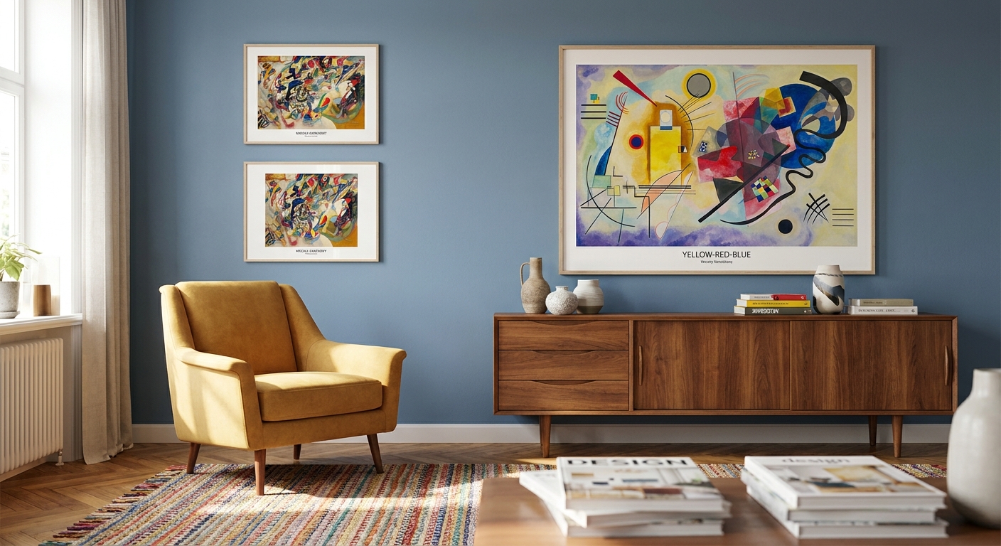
Wassily Kandinsky invented abstract painting on purpose, not by accident, and his geometric compositions still read as loud, confident and slightly chaotic in a way most modern prints don't. If you want kandinsky prints that actually earn a wall in 2026 rather than sit there looking like a poster from a dorm room, the picks below separate the pieces worth framing from the ones that fight your furniture.
- Kandinsky prints suit bold, colour-confident rooms — Composition VIII and Yellow-Red-Blue are the strongest 2026 picks.
- Go 100cm or larger on canvas width or the geometric detail reads as clutter, not art.
- Skip glossy framed glass in north-facing rooms — glare erases the fine linework Kandinsky is known for.
- Neutral furniture, loud wall — the print should be the loudest thing in the room, not competing with a patterned sofa.
Why this matters
Kandinsky founded Der Blaue Reiter movement in 1911 and spent the next three decades pushing painting away from representation entirely — by the time he painted Composition VIII in 1923, colour and shape were doing all the work, with no landscape or figure left to lean on. That's exactly what makes his work different from the calmer, moodier abstraction you see from artists like Mark Rothko: Kandinsky prints are busy, geometric and unapologetically saturated, which means they demand a different kind of room than a soft colour-field piece does.
Browse the full range of curated canvas prints on Gioia Wall Art before committing to a size, because Kandinsky's compositions punish undersizing more than most styles do.
Who this is for
This guide is for the buyer who wants a wall that says something, not a wall that blends in. You're furnishing an open-plan living room, a home office, or a reading nook that's gone beige for too long, and you want one piece of art to carry the whole colour story. If your taste runs toward Japandi calm or coastal neutrals, a Kandinsky print will fight your room rather than finish it — that buyer needs a different guide entirely.
What to look for in Kandinsky prints for vibrant interiors
Colour saturation over colour matching
Don't shop for a Kandinsky print that matches your cushions — shop for one that's louder than your cushions. His compositions work as a focal point precisely because they refuse to coordinate, and a print chosen to "go with" the sofa usually ends up looking apologetic on the wall.
Scale relative to your wall
A Kandinsky print under 60cm reads as a poster no matter how good the reproduction is. Anything meant to anchor a feature wall in 2026 needs to sit at 100cm or wider — the geometric shapes need room to breathe or they collapse into visual noise from across the room.
Framed vs unframed presentation
A raw canvas print with no glass keeps the colour saturation intact and suits Kandinsky's flat, graphic style better than glass framing does. Glass adds glare in daylight and mutes the very contrast you bought the piece for.
Geometric balance in the room
Kandinsky's compositions are already busy, so the room around them needs to simplify. A feature wall statement piece works when the rest of the wall is empty — don't stack a Kandinsky print into a gallery wall with five other frames.
Lighting exposure
Direct sun fades pigment and, worse, blows out the fine linework that separates a good Kandinsky reproduction from a flat one. North-facing walls in Australian homes need either a UV-filtered print finish or placement away from the window line.
Top picks: which Kandinsky compositions actually work
Composition VIII (1923) — the geometric anchor
This is the piece most people picture when they think "Kandinsky": circles, triangles and hard diagonal lines in red, yellow and black across a single canvas. Painted in 1923 during his Bauhaus years, it's the most structurally confident of his major works and the easiest to size large without losing coherence. Buy — it's the safest entry point into vibrant abstract art for a first-time buyer.
Yellow-Red-Blue (1925) — the colour-block statement
Three primary colours split across a canvas that's nearly 2 metres wide in the original 1925 painting, with none of the busy overlapping shapes of Composition VIII. It suits a room that already has strong architectural lines — exposed beams, a staircase, a long hallway. Buy for open-plan spaces where you need one piece to read from 4 metres away.
Several Circles (1926) — the safe pick
Thirty-plus overlapping circles in graduated colour, painted in 1926, give this piece a rhythm that's easier to live with day-to-day than the sharper diagonals of his other Bauhaus work. It's the Kandinsky print that works in a study or home office without becoming visually exhausting by week three. Buy for anyone nervous about going too bold.
Swinging (1925) — the wildcard
Dense, layered geometric shapes in muddier tones than his brighter primaries — this one rewards close viewing more than distance viewing, which makes it a poor choice for a large open room. Consider it only for a smaller, more contemplative space like a reading nook, not a living room feature wall.
On White II (1923) — the quiet crossover
Black lines and colour blocks floating on a mostly white ground, painted in 1923, this is the one Kandinsky composition that plays reasonably well with a minimalist or Scandinavian room. It's still abstract, but the white space does a lot of the calming work the other four pieces don't offer. Consider if you want the Kandinsky name without the full visual volume.


If you'd rather anchor the room with an original rather than a reproduction, pairing a Kandinsky print with a genuine abstract original from Gioia Wall Art gives the wall two layers of texture instead of one flat print doing all the work.
What to avoid
- Small framed prints under 50cm — Kandinsky's detail disappears at that scale and the piece reads as decorative filler, not a statement.
- High-gloss glass framing in bright rooms — glare wipes out the fine linework that separates a sharp reproduction from a muddy one.
- Pairing with another loud abstract piece on the same wall — two Kandinsky-style prints competing for attention cancel each other out; if you want a second abstract voice, something calmer like Mark Rothko prints balances the room instead of doubling the noise.
Verdict comparison
| Composition | Best for | Scale | Verdict |
|---|---|---|---|
| Composition VIII (1923) | Living rooms, first-time buyers | 100cm+ | Buy |
| Yellow-Red-Blue (1925) | Open-plan spaces | 120cm+ | Buy |
| Several Circles (1926) | Home offices, studies | 80-100cm | Buy |
| Swinging (1925) | Reading nooks only | 60-80cm | Consider |
| On White II (1923) | Minimalist crossover rooms | 80-100cm | Consider |
FAQ
What's the best Kandinsky print for a living room?
Composition VIII (1923) is the strongest living room pick because its bold circles and diagonals read clearly from across an open room at 100cm or wider. Yellow-Red-Blue works just as well if your living room already has strong architectural lines.
Is Kandinsky too abstract for a bedroom?
Most of his work is too visually loud for a bedroom meant for winding down. On White II (1923) is the exception, since its white background and sparser composition sit calmer than his denser Bauhaus pieces.
How much does a Kandinsky canvas print cost in Australia in 2026?
Canvas reproduction prints of Kandinsky's work vary by size and print quality, with larger feature-wall sizes costing more than small framed pieces. Check current pricing directly against the size and finish you need.
Should Kandinsky prints be framed or unframed?
Unframed canvas keeps the colour saturation and contrast intact, which matters more for Kandinsky than for softer, muted styles. Framed glass options work but risk glare in bright rooms.
What size Kandinsky print suits a feature wall?
100cm or wider is the minimum for a feature wall in 2026 — anything smaller reads as a poster rather than a statement piece. Rooms with high ceilings or long walls can go to 150cm or beyond.
Do Kandinsky prints work with Scandinavian interiors?
Mostly no — Scandinavian and Japandi rooms lean on calm, muted palettes that clash with Kandinsky's saturated primaries. On White II is the closest crossover option if you want the name without the full visual volume.
What's the difference between Composition VIII and Yellow-Red-Blue?
Composition VIII (1923) is busier, with overlapping circles, triangles and diagonal lines in multiple colours. Yellow-Red-Blue (1925) is calmer and more graphic, splitting the canvas into three broad colour blocks instead.
Can I mix Kandinsky prints with other abstract artists?
One loud abstract piece per wall works best — a second Kandinsky-style print competes rather than complements. Pairing with a calmer artist like Mark Rothko balances the room instead of doubling the visual noise.
One last thing
Kandinsky didn't paint his first fully abstract work until around 1911, more than a decade into his career as a representational painter — the geometric style everyone associates with his name is actually the second half of his output, not the whole story. If a Kandinsky print in a showroom looks oddly restrained compared to what you expected, it's probably from his earlier, looser period rather than the Bauhaus compositions from the 1920s that most vibrant-interior buyers actually want.


