
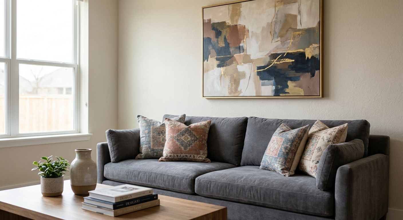
Matching wall art to your sofa comes down to one skill: reading undertones, not just the base colour, then deciding whether your art should match, complement, or contrast that palette. This guide walks through the exact steps to pick canvas prints and original paintings that sit right above your lounge in 2026.
- Identify your sofa's undertone first — grey sofas often lean blue, green or brown, not true neutral.
- Pull 3 swatches from the sofa fabric before you shop for art, not after.
- Contrast works better than exact colour matching on a feature wall in 2026 lounge rooms.
- Test scale by taping paper to the wall before buying a large canvas print.
- Neutral sofas give the most freedom — bold original paintings like Shiraz or Golden Field Serenit both work.
Why this matters
A sofa is the biggest colour block in most living rooms, and wall art sitting above or beside it either pulls the whole space together or fights it every day. Buy art that only matches the sofa's base colour and the room reads flat within 2026 as trends shift toward tonal contrast rather than exact colour-matching. Get the undertone wrong and even an expensive canvas print looks slightly off, and you won't always be able to name why.
The fix isn't complicated. It's a short sequence: read the undertone, choose your strategy, test scale, then commit. Skip the undertone step and everything downstream gets harder.
What you'll need
- A fabric swatch or cushion cover from your actual sofa (not a photo — screens shift colour)
- Painter's tape and a sheet of paper the size of your intended art
- Natural daylight to view swatches in (avoid warm bulb light when judging tone)
- A shortlist of 2-3 art pieces or prints you're considering
- 10 minutes to sit with the space before deciding
The steps
1. Identify your sofa's undertone
Most sofas that look "neutral" carry a hidden undertone — warm (yellow, orange, pink) or cool (blue, green, grey). Hold the fabric swatch next to a plain white sheet of paper in daylight; if it looks slightly yellow or pink against the white, it's warm. If it looks slightly blue or green, it's cool.
This matters because art with the opposite undertone can clash even when the actual colours seem compatible on paper. A charcoal sofa with a blue undertone will fight a painting with warm terracotta tones, even though "grey and orange" sounds like a safe pairing in theory. Common mistake: judging undertone under warm LED bulbs at night, which pushes everything toward yellow and hides the true colour.
2. Pull 3 colour swatches from the sofa fabric
Look closely at the weave and pick out the three most present colours, not just the dominant one. A "beige" linen sofa might actually carry beige, a soft grey shadow tone, and a warm cream highlight.
Write these three down or photograph them in daylight. These become your reference points when you're scanning art online, so you're not guessing from memory while scrolling. Expected outcome: a simple three-colour palette you can hold up against any print before buying.
3. Decide: match, complement, or contrast
There are three legitimate strategies, and picking one before you shop saves hours of second-guessing.
- Match — art pulls one of the sofa's three swatch colours directly. Safe, cohesive, low risk.
- Complement — art uses a colour adjacent to the sofa tone on the colour wheel. Adds interest without clashing.
- Contrast — art uses a bold opposite tone (deep burgundy against a soft grey sofa, for example) to anchor the room. Higher risk, higher payoff.
For a feature wall above the sofa, contrast tends to read as more intentional in 2026 living rooms than an exact match — a statement piece does more visual work than a print that blends in.
4. Test scale against your wall
Colour matters less if the art is the wrong size. Tape a sheet of paper (or several sheets joined together) at the exact dimensions you're considering, then step back to the doorway and look.
Art above a sofa should generally span roughly two-thirds of the sofa's width — too narrow and it floats, too wide and it overwhelms. Common mistake: buying art scaled to the wall instead of the sofa; the sofa is your real anchor point, not the empty wall space around it.
5. Check the room's other fixed colours
Flooring, curtains, and any built-in cabinetry are permanent — your sofa and art both need to sit comfortably with them. Walk the room and list every fixed colour before finalising a choice.
A warm oak floor with cool-grey walls creates a split palette that either the sofa or the art needs to bridge. If your sofa already leans warm, let the art lean warm too rather than adding a third competing temperature to the room.
6. Order a swatch or small print before committing to a large piece
Most colours shift on screen versus in your actual room lighting. Before buying a large original painting or a big canvas print, check a smaller version or a fabric/paper swatch against the sofa in person.
This single step avoids the most expensive mistake in this whole process: spending on a large statement piece that reads completely differently once it's on your wall in your specific light.
7. Hang it and live with it for a week
Colour perception changes with morning versus evening light, and with what else is in the room day to day. Hang the piece, then genuinely wait a week before deciding it's wrong.
Expected outcome: most pairings that feel slightly off on day one settle in once your eye adjusts. If it still feels wrong after a week in different light conditions, that's a genuine signal to swap it, not impatience.


Troubleshooting
- My sofa is patterned, not solid — pull one colour from the pattern's background, not the accent colour, and match art to that instead. Patterned upholstery already has enough visual noise.
- My sofa is grey and I can't tell the undertone — check the shadows in the fabric folds; shadowed grey almost always reveals whether it leans blue, green, or brown.
- The art looks great online but wrong on the wall — screen colour profiles compress saturation; always check against a physical swatch before committing to a large piece.
- My leather sofa is a strong colour (tan, black, oxblood) — treat leather as the dominant colour and choose art that complements rather than competes; leather doesn't hide a clashing print the way fabric texture does.
- The wall looks bare even with art hung — the piece is likely undersized for the sofa; revisit step 4 and check the two-thirds width rule.
- I have two different sofas in an open-plan space — pick one as the anchor (usually the larger or more visible one) and let art relate primarily to that one.
Tools and resources
- Right size wall art guide for the two-thirds sofa-width rule in more detail
- A physical fabric swatch from your sofa (upholsterers can usually supply an offcut)
- Painter's tape and paper for the scale test in step 4
- Natural daylight — the most reliable free tool in this whole process
What to do next
Once the sofa-to-art pairing is settled, the rest of the room follows the same undertone logic — cushions, throws, and any secondary art pieces. The room-by-room wall art guide walks through applying this same approach beyond the living room, including dining areas and hallways.
FAQ
Does wall art need to match my sofa exactly?
No, exact colour matching isn't required and often reads as flat. Pulling one accent colour from the sofa, or choosing a deliberate contrast, generally looks more considered in a 2026 living room.
What colour wall art goes with a grey sofa?
Check whether the grey leans blue, green or brown first, then either match that undertone or contrast with a warm tone like terracotta or mustard. True neutral grey is rare — most grey fabric has a hidden undertone.
Is it better to match or contrast wall art with a sofa?
Contrast tends to create a stronger focal point above a sofa, while matching creates a calmer, more cohesive look. Choose contrast for a feature wall and matching for a quieter, restful room.
How big should wall art be above a sofa?
Wall art above a sofa should span roughly two-thirds of the sofa's width. Anything narrower tends to look disconnected, and anything wider can overwhelm the seating area.
Can I use a bold original painting with a neutral sofa?
Yes, a neutral sofa gives the most freedom for bold colour choices in art. Deep tones like burgundy or forest green work well as a contrast anchor against beige, cream or grey upholstery.
What if my sofa is patterned or textured?
Pull a colour from the pattern's background rather than its accent colours, since the background sets the room's real undertone. Keep the art simpler in composition to balance the busier upholstery.
Should I test art colour before buying a large canvas print?
Yes, check a smaller version or a physical swatch against your sofa in natural daylight before committing to a large piece. Screen colours shift enough that a large print can look noticeably different once hung.
How long should I wait before deciding art doesn't work with my sofa?
Give it at least a week, since light changes throughout the day and your eye adjusts to new colour pairings over time. Many pairings that feel slightly off on day one settle in within a few days.
One last thing
Most people shop for art matched to their walls, when the sofa is the bigger colour commitment in the room and the one that's harder to change. Start every wall art decision from the sofa's undertone, not the paint colour, and the rest of the room falls into place faster.


