
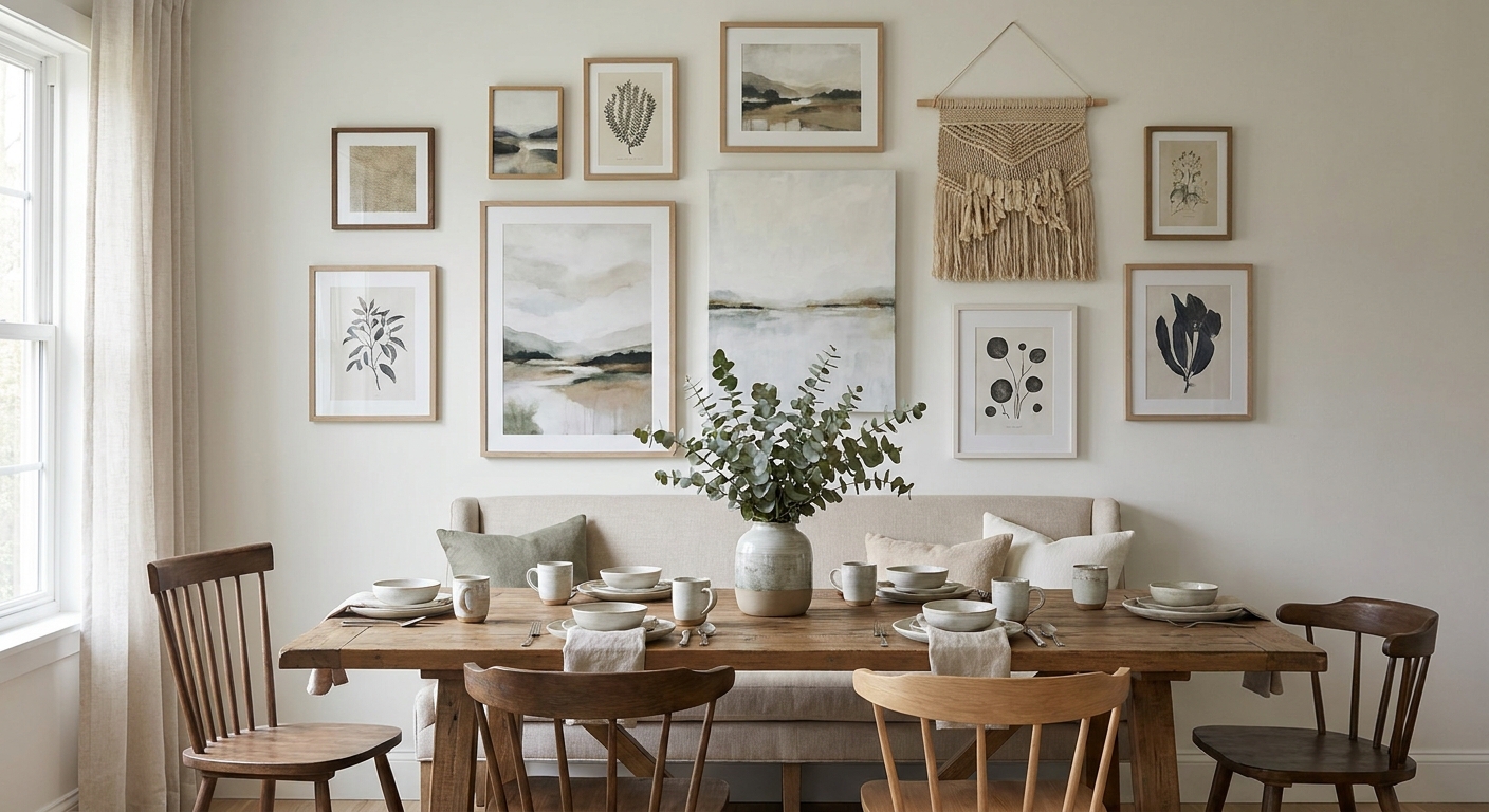
Dining rooms get more eye time than almost any other room in the house — you sit facing the same wall for every meal, every dinner party, every Sunday roast. Getting the wall art wrong here is more noticeable than in a hallway you walk past in two seconds.
- Mediterranean Lunch and Olive Still Life are the safest wall art for dining rooms picks in 2026 for anyone styling above a table or buffet — Buy.
- Scale rules over subject: art should span roughly 75% of your sideboard or table width to avoid looking stranded.
- Skip anything under glass in a room with a pendant light directly above the table — glare ruins sightlines during dinner.
- Botanical, still life and coastal palettes from Gioia Wall Art outperform bold graphic prints for shared-meal spaces.
Why this matters
A dining room wall gets looked at for 20-40 minutes at a stretch, not glanced at in passing. That changes the calculus completely compared to a hallway or a home office. Loud, busy prints that work fine as a quick visual accent become tiring across a long dinner. The how to choose wall art for every room in your home guide covers room-by-room basics — this one goes deeper on the specific problems dining rooms create: reflective surfaces, food-adjacent subject matter, and shared sightlines across a table full of people with different tastes.
Who this is for
This guide is for anyone hanging art above a dining table, buffet, sideboard, or the blank wall behind six dinner chairs — whether you're furnishing a first apartment dining nook or finishing a full renovation in 2026. It's built around the constraints unique to dining spaces: sustained viewing distance, proximity to food and steam, and the fact that everyone at the table sees the same wall from a slightly different angle.
What to look for in wall art for dining rooms
Size relative to the table and furniture below it
A small print above a large buffet reads as an afterthought, not a decision. The general design rule is to keep artwork at roughly 75% of the width of the furniture piece beneath it — a 180cm sideboard wants art in the 130-150cm range, not a single 40cm print floating in space. Undersized art is the single most common dining room mistake.
Color and tone that match the table finish
Dining tables are usually the largest fixed color block in the room — timber, marble, or a painted finish you're not swapping out. Wall art in warm earth tones works with timber; cooler greens and blues sit better against marble or stone. Clashing undertones (orange-warm wood against a cold blue-grey print) is the second most common miss.
Glare and glass placement
Pendant lights hang directly over most dining tables, and that light bounces straight off glass-framed prints at eye level. If your table sits under a pendant or near a window, choose canvas prints or matte finishes over glass-fronted frames — glare during dinner is distracting in a way it never is in a hallway.
Subject matter suited to shared meals
Still life, botanical, coastal, and abstract landscape work consistently better in dining rooms than portraiture or anything visually intense — you want something that supports conversation, not competes with it. This is where food-adjacent and nature themes (citrus, olive branches, coastal views) earn their reputation as dining room staples.
Framing that handles proximity to the kitchen
Dining rooms near open-plan kitchens deal with more humidity and temperature swings than a bedroom or study. Canvas holds up better than paper prints in these conditions, and a solid timber or aluminium frame outlasts a budget clip-frame over years of use.
Hang height for a seated room
Most hanging-height advice assumes a standing viewer, but dining rooms are viewed mostly from a seated position. Centering artwork around 145-155cm from the floor — slightly lower than the standard 152-160cm gallery rule — keeps it in a seated sightline rather than above it.
Top picks for dining room walls
Mediterranean Lunch — the safe pick. A food-and-table-themed composition that reads as intentional rather than random above a dining buffet, and it avoids the loud color clashes that fight with timber furniture. Works in rooms with warm or neutral palettes. Buy for anyone who wants a literal thematic tie to the room without going kitschy — see it at Mediterranean Lunch.
Under The Fig Tree — the wildcard. A botanical composition with a slightly moodier tone than most dining picks, better suited to a dining room with darker cabinetry or a statement pendant light rather than an all-white, bright space. Consider it if your dining room already leans dramatic rather than airy.
Olive Still Life — the grounding pick. Muted, food-adjacent, and low-contrast enough to sit behind a table without pulling focus from place settings or a centerpiece. Works especially well in a room where the art needs to support conversation rather than start one. Buy for a first dining room piece if you're unsure what else to commit to — see it at Olive Still Life.
Earth's Gathering (Green Tones) — the color-matching pick. A green-toned abstract that pairs naturally with timber tables and rattan or linen dining chairs, common in 2026 Japandi and coastal-luxe dining setups. Buy if your dining room leans natural-material rather than high-gloss. See it at Earth's Gathering, Green Tones.
Pistachio Hydrangea — the softer floral option. Lighter and more pastel than the other four, better suited to a bright, white-walled dining nook than a moody, dark-timber space. Consider it for smaller apartment dining areas where you want softness over statement.


What to avoid in dining room wall art
- Anything under glass paired with a pendant light directly overhead. The reflection bounces straight into diners' sightlines during evening meals — canvas or matte finishes solve this.
- Undersized prints over large furniture. A single 40-50cm print above a 180cm+ buffet reads as an afterthought, not a styling choice, regardless of how good the artwork itself is.
- Portraiture and intense figurative work. It's fine in a hallway you pass in seconds; across a 30-minute dinner it becomes the thing everyone stares at instead of talking.
Verdict comparison
| Pick | Best for | Verdict |
|---|---|---|
| Mediterranean Lunch | Warm, neutral dining rooms | Buy |
| Under The Fig Tree | Moody, dark-timber rooms | Consider |
| Olive Still Life | First-time buyers, undecided rooms | Buy |
| Earth's Gathering (Green Tones) | Japandi and coastal-luxe styling | Buy |
| Pistachio Hydrangea | Bright, white-walled apartments | Consider |
FAQ
What's the best wall art for dining rooms in 2026?
Botanical, still-life and coastal-toned canvas prints like Mediterranean Lunch and Olive Still Life work best because they suit long viewing sessions without becoming visually tiring. Bold graphic or figurative prints tend to overwhelm a shared dining space.
Is canvas better than framed glass for a dining room?
Canvas is generally better for dining rooms because it avoids the glare that glass-fronted frames throw off under pendant lighting. Canvas also handles the humidity near an open-plan kitchen better than paper prints over time.
How high should I hang art above a dining table?
Center the artwork around 145-155cm from the floor, lower than the standard 152-160cm gallery rule, because dining rooms are viewed mostly from a seated position. This keeps the piece in a natural seated sightline rather than above it.
What size wall art works above a dining buffet?
Aim for artwork roughly 75% the width of the buffet or sideboard beneath it. A 180cm buffet suits a piece in the 130-150cm range rather than a single small print.
Should dining room wall art match the table color?
Yes, warm earth tones pair better with timber tables while cooler greens and blues suit marble or stone finishes. Clashing undertones are one of the most common dining room styling mistakes.
Is floral or botanical wall art too much for a dining room?
Botanical and floral prints in muted palettes, like Pistachio Hydrangea or Earth's Gathering, work well in dining rooms because they support conversation rather than compete with it. Bright, high-contrast florals can feel busy in a room where people sit for extended periods.
Can I use a set of two or three prints instead of one large piece?
Yes, sets work well over a buffet or sideboard as long as the combined width still hits roughly 75% of the furniture below. Sets also spread visual weight more evenly across a long wall than one small centered piece.
What should I avoid hanging in a dining room?
Avoid portraiture, intense figurative work, and anything glass-framed under a direct pendant light. Both become distracting across the 20-40 minutes most people spend seated at a dining table.
One last thing
The detail most people miss isn't the artwork itself — it's the pendant light above the table. Check where the glare lands before you buy anything glass-framed; a piece that looks perfect in a showroom photo can throw a hard reflection straight into your seat once it's hung under your own lighting.


