
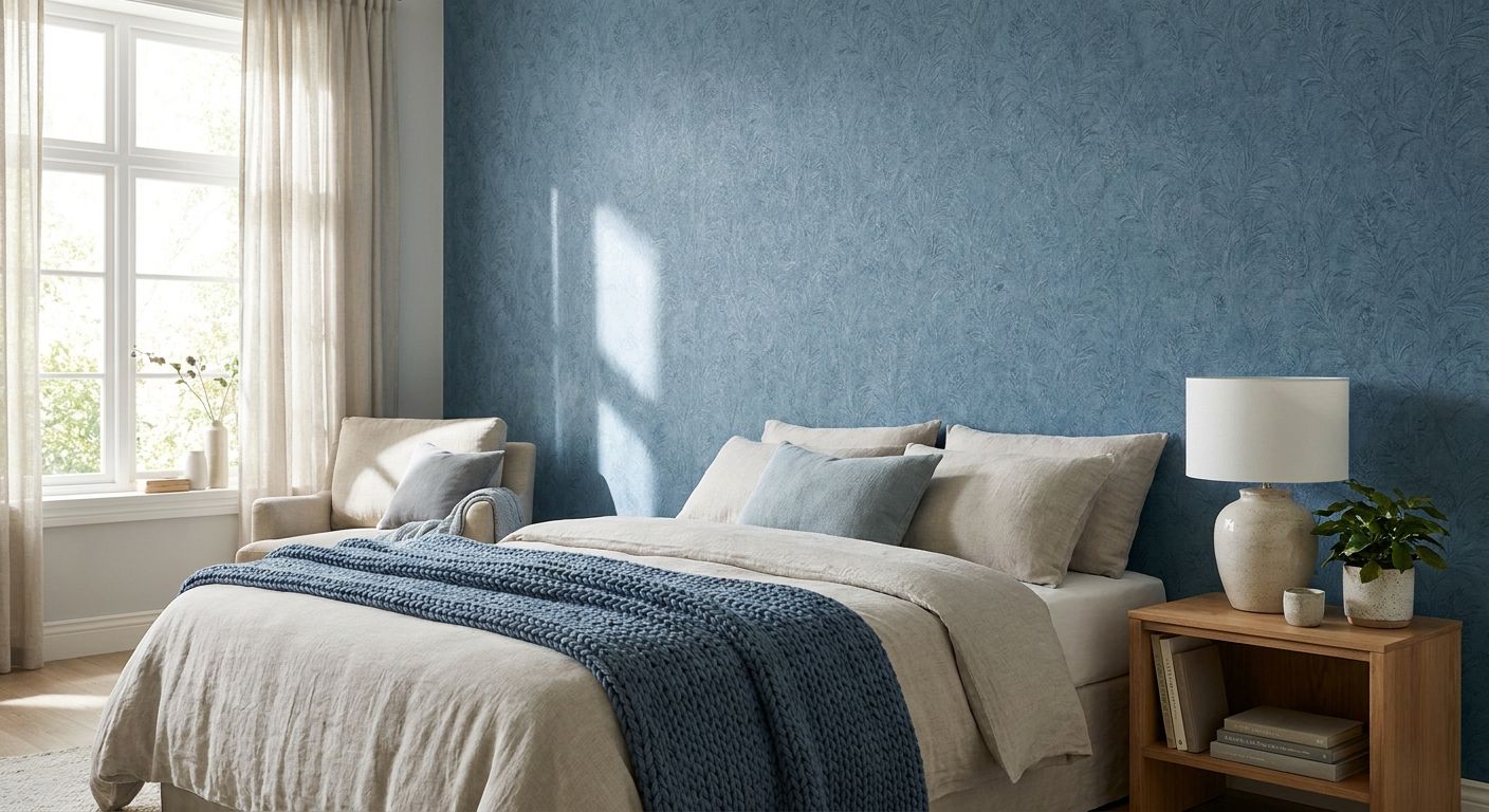
Blue wallpaper for a calming bedroom is wallpaper in cool, muted blue tones used to reduce visual noise in a sleep space, with the aim of making the room feel quieter the moment you walk in rather than acting as a bold style statement. A bedroom has different needs to a living room or office: low light at night, close-up viewing from the bed, and a pattern scale that shouldn't compete with cushions, throws and framed prints already on the wall.
- Cool blue wallpaper with a grey or green undertone reads calmest in most Australian bedrooms in 2026, warmer sky blues read more energetic.
- Peel-and-stick blue wallpaper suits renters and short-term leases; traditional pasted rolls suit owners wanting a seamless long-term finish.
- Matte finishes hold the calming effect better than gloss, which bounces light and can disrupt sleep in a dark room.
- Test a sample against your actual bedroom light before committing to a full wall, colour temperature shifts blue more than any other hue.
- Gioia Wall Art's blue-toned patterns pair well with warm timber furniture and linen bedding rather than chrome or high-gloss finishes.
Why blue wallpaper matters for a calming bedroom
Blue is the colour most bedroom designers reach for first when a client says "I want it to feel like a hotel room" or "I just want to sleep better in here." It reads as sky and water, both associations tied to rest rather than stimulation, which is why blue dominates bedroom colour searches across Australian interior sites year after year.
The catch is that not all blue does the same job. A bright cobalt or electric blue can feel as stimulating as red in a small room, while a washed-out powder blue with a grey undertone sits quietly in the background. Getting the calming effect out of blue wallpaper comes down to undertone, sheen and how it's balanced against the rest of the room, not the colour name on the swatch.
A muted, grey-based blue wallpaper reads calmer in a bedroom than a bright sky blue, no matter how small the difference looks on a paint chip.
Choose the right undertone before anything else
Undertone decides whether a blue feels restful or restless once it's covering four walls instead of a small swatch. Blues with a hint of grey, green or violet in them recede and calm a room; blues pulled toward purple or straight primary blue tend to advance and energise it.
- Look for wallpaper described as "dusty", "muted", "slate" or "denim" blue for the calmest result
- Avoid pure primary or electric blues in a room under 12 square metres
- Hold the sample against your existing bedding and curtains, not just the wall, before deciding
- Check the undertone in both daylight and lamp light since warm bulbs shift blue toward green
- If the room already has cool grey flooring, choose a blue with a warm grey undertone to avoid the space feeling cold
Test the wallpaper in your actual bedroom light
Colour temperature changes blue more than any other hue on the wheel, which is why a sample that looked perfect in the shop can look wrong once it's on your wall. North-facing rooms in Australia get warmer, more direct light; south-facing rooms stay cooler and can push a mid-blue toward grey.
- Order a physical sample rather than judging from a screen photo
- Pin the sample to the wall you're papering, not a different wall in the house
- Check it at 7am, midday and after dark with your bedside lamp on
- Compare it next to your doona cover and curtains in the room, not in another room
- Give it 24 hours before deciding, first impressions in unfamiliar light are unreliable
Match wallpaper weight to your room size
A busy, high-contrast pattern in a saturated blue can overwhelm a small bedroom, while a plain or subtly textured blue wallpaper works in almost any size room. Larger bedrooms can carry more pattern without feeling cluttered because the eye has more space to rest between motifs.
- Small or box-shaped bedrooms: choose a tonal or textured blue with minimal pattern contrast
- Larger bedrooms: a soft botanical or watercolour-style blue pattern adds interest without overwhelming
- Low-ceiling rooms: skip large-scale motifs that emphasise horizontal repeats
- North-facing small rooms: a lighter, warmer blue keeps the space from feeling closed in
- If in doubt, wallpaper one feature wall behind the bed rather than all four
Decide between an accent wall and a full room
Most calming-bedroom results come from wallpapering the wall behind the bed head and painting the remaining three walls a complementary neutral. A full-room wrap in blue wallpaper is a bigger commitment and works best in bedrooms with generous natural light, since blue can read dark in a dim room once it surrounds you on every side.
- Accent wall behind the bed: lowest cost, easiest to change later, still delivers the calming focal point
- Full room wrap: strongest immersive effect, needs good natural light or supplementary warm lighting
- Two-wall treatment (bed wall plus adjoining wall): a middle ground for larger bedrooms
- Ceiling plus bed wall: creates a cocooned effect, best reserved for bedrooms with high ceilings
- Test the accent-wall option first if you're unsure blue will suit the room long term
Choose peel-and-stick or traditional pasted wallpaper
The installation method matters as much as the colour if you're renting, sharing a lease, or simply don't want a tradesperson booked in. Peel-and-stick wallpaper removes without damaging most rental walls, while traditional pasted wallpaper gives a more seamless, permanent finish for owners.
- Renters and short leases: peel-and-stick blue wallpaper, removable without wall damage
- Long-term owners wanting a flawless finish: traditional pasted wallpaper, professionally hung
- First-time DIYers: peel-and-stick, more forgiving of small application errors
- Textured or heavily patterned rooms: traditional paste, better seam matching over large areas
- If you're not sure the blue will suit the room in a year, start with peel-and-stick before committing to paste
Gioia Wall Art's peel-and-stick wallpaper for Australian renters covers this exact decision in more depth if the lease is the deciding factor.
Layer wall art on top of the calm base
Blue wallpaper works as a backdrop, not the finished room. A single framed print or a small grouping above the bedside table adds warmth and personality without breaking the calming effect, provided the art itself stays low-contrast and doesn't fight the wallpaper pattern.
- One framed print above the bedside table, not a full gallery wall, on a patterned wallpaper wall
- Botanical or landscape prints in muted tones sit well against dusty blue backgrounds
- Skip bold graphic or high-contrast black-and-white prints on a patterned accent wall
- Save gallery walls for the plain painted walls in the room, not the wallpapered one
- Match frame finishes (timber, black, brushed brass) to the room's existing hardware
For the mechanics of combining pattern and framed pieces without it looking busy, layering wallpaper with framed art walks through the spacing rules.
Comparison: blue wallpaper options for a calming bedroom
| Option | Best for | Key limitation |
|---|---|---|
| Peel-and-stick blue wallpaper | Renters, share houses, first-time DIY | Seams show more on heavily textured walls |
| Traditional pasted blue wallpaper | Owners wanting a permanent, seamless finish | Needs professional hanging for a clean result |
| Accent wall only | Any bedroom size, especially small rooms | Less immersive than a full-room treatment |
| Full room wrap | Larger bedrooms with strong natural light | Can read dark in low-light or south-facing rooms |
Verdict: for most Australian bedrooms in 2026, a muted blue peel-and-stick wallpaper on the bed wall only is the lowest-risk way to get the calming effect without a full renovation commitment.


Common mistakes in a calming blue bedroom
- Choosing the colour under shop lighting only. Fluorescent retail light flattens undertone, a blue that looks neutral in-store can read cold or purple at home.
- Wallpapering all four walls in a small, dark bedroom. Full-room blue without enough natural light makes the space feel smaller and dimmer, not calmer.
- Matching the wallpaper to the doona cover exactly. An identical match reads flat; a tonal contrast between wallpaper and bedding gives the room depth.
- Ignoring the ceiling colour. A bright white ceiling against a dark blue wallpaper can feel visually jarring; a soft off-white or pale blue ceiling ties the room together.
- Skipping the sample stage to save time. Blue shifts more under artificial light than any other colour family, and a full roll is a bigger mistake to unwind than a $9.99 sample.
FAQ
What shade of blue wallpaper is most calming for a bedroom?
A muted, grey-based blue such as slate or dusty denim is the most calming choice for a bedroom in 2026. Bright cobalt or electric blues tend to energise a room rather than relax it, especially in spaces under 12 square metres.
Is peel-and-stick blue wallpaper as good as traditional wallpaper?
Peel-and-stick blue wallpaper removes cleanly from most rental walls and suits short leases, while traditional pasted wallpaper gives a more seamless finish for long-term owners. Neither is objectively better, the right choice depends on whether you own or rent.
Should I wallpaper the whole bedroom or just one wall?
Wallpapering just the wall behind the bed is the lower-risk option and works in almost any room size. A full-room wrap gives a stronger immersive effect but needs strong natural light to avoid the space feeling dark.
Does blue wallpaper make a small bedroom look smaller?
A dark, heavily patterned blue can make a small bedroom feel tighter, but a light, tonal blue with minimal pattern contrast has the opposite effect and can open the room up. Pattern scale matters more than the colour itself.
What wall art goes well with blue wallpaper in a bedroom?
Muted botanical or landscape prints in low-contrast tones sit best against blue wallpaper without competing with the pattern. Save bold, high-contrast or graphic prints for the plain painted walls in the room instead.
How do I stop blue wallpaper looking cold?
Pair blue wallpaper with warm timber furniture, linen bedding and warm-white lighting rather than chrome or cool-white bulbs. A warm grey undertone in the wallpaper itself also helps avoid a cold, sterile look.
Can I use blue wallpaper in a bedroom with limited natural light?
Yes, but choose a lighter or more tonal blue rather than a deep navy, and treat it as an accent wall rather than a full-room wrap. Deep blues in low-light rooms can read almost black once the sun goes down.
How much wallpaper do I need for one bedroom wall?
Measure the wall's width and height in metres and check the roll coverage listed against that specific pattern before ordering, coverage varies by design and repeat size. Ordering a sample first confirms the colour before you calculate quantity.
One last thing
The undertone test matters more than the colour name every single time: two wallpapers both labelled "blue" can read completely differently once they're up, because one leans grey and the other leans violet under your specific globe temperature. Order the physical sample, pin it up for 24 hours, and judge it under your actual bedside lamp before you commit a whole wall to it in 2026.


