
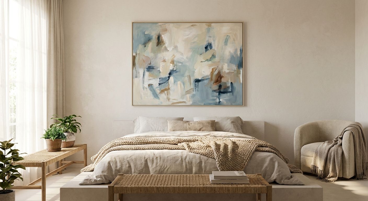
Abstract wall art turns a bedroom from a place you sleep into a room you actually want to sit in — soft shapes, muted palettes and no hard edges make it one of the easiest ways to build a calming bedroom retreat in 2026. Get the palette and scale wrong, though, and the same piece that should soothe you ends up competing with your lamp for attention at 11pm.
- Abstract wall art for bedroom retreats works best in muted, low-contrast palettes — skip hard black outlines.
- Mark Rothko-style colour-field prints are the safe pick for a calming bedroom in 2026 — Buy.
- Above-the-bed pieces should sit 15-20cm above the headboard for the right visual weight.
- Skip high-saturation abstracts (neon, primary red, hard geometric pop art) — they energise rather than calm.
Why this matters
A bedroom is the one room where wall art has a job beyond decoration: it has to help you switch off. Sharp contrast, busy composition and cool white light all keep the brain in an alert state, which is the opposite of what a retreat needs. Abstract wall art solves this because it removes recognisable objects and hard narrative detail — your eye has nothing to "read," so it settles instead of scanning.
At Gioia Wall Art, the pieces that get requested most for bedrooms in 2026 share three traits: tonal palettes (no more than 3-4 colours), soft edges rather than hard geometric lines, and a scale that's generous without swallowing the wall. Everything below is built around those three levers.
Who this is for
This guide is for anyone styling a bedroom to actually function as a wind-down space — renovators finishing a main bedroom, apartment dwellers upgrading a rental-friendly retreat, and anyone replacing a busy gallery wall with one considered statement piece above the bed. If your bedroom currently has a TV mounted opposite the bed and motivational typography on the side wall, this is written for you.
What to look for in abstract wall art for a calming bedroom
Colour palette and tonal range
A calming bedroom palette stays within 3-4 related tones — think dusty blue into charcoal, or terracotta into cream — rather than jumping across the colour wheel. High-contrast combinations (black on white, red on navy) read as energetic even in an abstract format, which works in a living room but fights the purpose in a bedroom.
Composition and line softness
Organic, blended shapes calm the eye faster than hard geometric grids. A soft colour-field composition gives your brain nothing sharp to fixate on, which is exactly why Rothko-style pieces have stayed a bedroom staple for decades — the blur at the edges of each colour block is doing real psychological work, not just aesthetic work.
Size relative to your bed
The most common bedroom mistake is undersizing. A piece above a queen or king bed should span roughly 60-70% of the headboard width — anything narrower looks like an afterthought, anything wider crowds the bedside tables. Measure your headboard before you shop, not after.
Texture and finish
Matte canvas absorbs ambient light and stays quiet at night; gloss-finish framed prints can throw glare from a bedside lamp straight back at you when you're trying to read. For a bedroom specifically, matte or satin canvas beats high-gloss glass framing almost every time.
Placement flexibility
If you're in a rental or plan to move within a couple of years, check how the piece is meant to hang. Canvas on a wooden stretcher is lighter and more forgiving on plasterboard than a heavy framed print, which matters if you're relying on picture hooks rather than wall anchors.
Print quality and colour accuracy
Abstract art lives and dies by its colour gradients — a cheap print job can turn a smooth Rothko-style blend into visible banding. Look for retailers who print on demand with archival inks rather than stock warehouse prints, since gradient abstracts show quality gaps faster than a photo print would.
Top picks for a calming bedroom retreat
Mark Rothko-inspired minimalist abstracts — the safe pick. These colour-field pieces use 2-3 blended tones across a large canvas, and they're the closest thing to a guaranteed-calm choice in the whole abstract category. One spec that matters: look for canvases starting around 100x150cm for a queen-size headboard so the scale actually fills the wall. Verdict: Buy — see the Mark Rothko prints for minimalist interiors collection.
Wassily Kandinsky-style vibrant abstracts — the wildcard. These bring more colour and geometric movement than a strict colour-field piece, and they suit a bedroom with an otherwise neutral base that needs one bold accent wall. The risk is overdoing it — one piece per room, not a matching pair. Verdict: Consider, and only if the rest of the room stays quiet.
Black-and-white monochrome abstracts — the no-fail neutral. Removing colour entirely takes the guesswork out of matching bedding and curtains, and a soft-edged monochrome abstract still reads as calm rather than stark because it avoids hard geometric lines. Verdict: Buy for anyone unsure about committing to a colour — browse black and white wall art for a monochrome home.
Terracotta and warm earthy abstracts — the cosy alternative. For bedrooms with timber floors or warm-toned linen, a terracotta-and-cream abstract ties the room together without introducing a new colour family. It reads warmer and slightly more grounding than a cool blue-grey palette. Verdict: Consider if your existing furnishings already lean warm — a cool-toned piece dropped into a warm room fights the rest of your styling instead of finishing it.
What to avoid
- High-saturation pop art or graffiti-style abstracts — bold primary colours and hard outlines are energising by design, which is the opposite goal for a sleep space.
- Motivational typography and quote art — text triggers reading, and reading is an alerting activity right before bed, not a calming one.
- Oversized gloss-framed pieces directly opposite the bed — glare from a bedside lamp or morning light bounces straight back at eye level, which undercuts the whole point of a retreat.
Verdict comparison
| Style | Palette | Best wall placement | Verdict |
|---|---|---|---|
| Rothko-style colour field | 2-3 blended tones | Above bed, 60-70% headboard width | Buy |
| Kandinsky-style vibrant abstract | Multi-tone, geometric | Feature wall, not above bed | Consider |
| Black and white monochrome | No colour, soft edges | Above bed or reading nook | Buy |
| Terracotta / warm earthy | Warm 3-tone palette | Above bed in warm-toned rooms | Consider |
FAQ
What is the best abstract wall art for a bedroom in 2026?
Rothko-style colour-field canvases in 2-3 blended tones are the safest calming choice for a bedroom in 2026. Black and white monochrome abstracts are the next best option when you want a colour-neutral retreat.
Is abstract wall art better than a photo print for a bedroom?
For a calming bedroom, yes — abstract art gives the eye nothing recognisable to scan, while photo prints of people or scenes keep the brain in a more alert, narrative-reading state. Landscape photography sits somewhere in between and works if you want a softer middle ground.
How big should abstract wall art be above a bed?
Aim for 60-70% of your headboard's width so the piece fills the wall without crowding bedside tables. For a queen bed that usually means a canvas starting around 100x150cm.
What colours are calming for bedroom wall art?
Muted, low-contrast tones such as dusty blue, charcoal, sage and terracotta read as calming, while high-saturation reds, neons and hard black-on-white contrast read as energising. Stick to 3-4 related tones rather than a full colour wheel.
Should abstract wall art in a bedroom be framed or unframed canvas?
Matte canvas is generally the better bedroom choice because it absorbs ambient light instead of reflecting a bedside lamp back at you. Framed prints with glass work fine on walls away from direct light, but avoid glass directly opposite a lamp or window.
Can abstract wall art work in a small bedroom?
Yes — a single large abstract piece actually reads calmer in a small bedroom than several small frames, because it reduces visual clutter rather than adding to it. One statement piece above the bed is the better move than a gallery wall in a tight room.
How high should abstract wall art hang above a bed?
Position the bottom edge of the piece 15-20cm above the headboard. Hanging it higher makes the composition float away from the bed, while hanging it lower crowds the pillows.
One last thing
The test that actually matters isn't how the piece looks standing in the doorway — it's how it reads from a seated position in bed, since that's the angle you'll actually view it from every night in 2026. Sit on the edge of the mattress before you commit to a size or placement; pieces that look perfectly scaled from the doorway often read too small once you're sitting where you'll actually be looking at them.


