
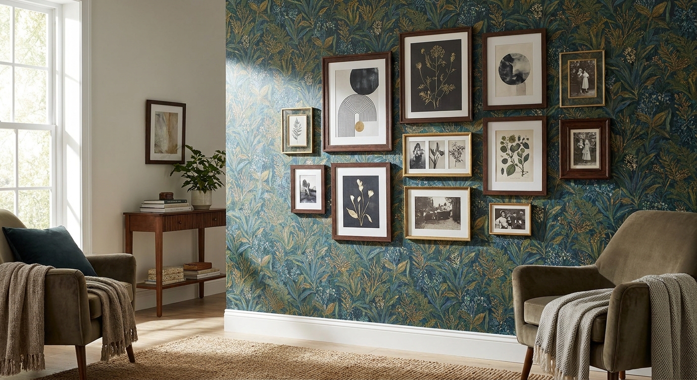
Wallpaper and framed art aren't rivals for wall space — they're a styling pair, but only when you sequence the decisions in the right order. This guide walks through how to combine wallpaper and wall art in one room without either element cancelling the other out.
- Pick one feature wall for wallpaper first, then size framed art to its pattern repeat — don't reverse the order.
- Match frame finish to wallpaper undertone: warm timber frames sit better on ochre or terracotta prints, black frames suit cool greys and blues.
- Test with paper templates before hanging anything — repositioning peel-and-stick wallpaper after art is up damages both.
- A gallery wall layout works on a plain wall; on patterned wallpaper, one to three larger framed pieces read cleaner in 2026 interiors.
- Renters: peel-and-stick wallpaper plus no-drill hanging strips let you layer both without losing a bond.
Why this matters
Most people layer wallpaper and framed art backwards — they buy the art first, then hunt for wallpaper that won't clash, and end up with a wall that looks busy from the doorway. Flip the order and the whole room gets easier to finish.
Wallpaper sets the pattern scale and colour temperature for the entire wall. Framed art has to work with that scale, not against it. Get the sequence right and you get a wall that looks curated rather than crowded — which is the whole point of pairing the two in 2026 interiors rather than picking one or the other.
What you'll need
- A tape measure and a pencil
- Painter's tape or paper templates cut to the size of each frame
- Wallpaper samples — order swatches before committing to a full roll
- 1-3 framed prints or one statement painting, depending on wall size
- Picture hooks rated for the frame weight, or removable adhesive strips for rental walls
- A second person to hold frames in place while you step back and check the sightline
- Half a day to plan and test placement, half a day to actually hang everything
If you're starting from zero on the art side, browse statement wall art for a feature wall before you order wallpaper — it's easier to match paper to an artwork you already love than the other way round.
The steps
1. Choose one wall, not the whole room
Wallpaper and framed art both carry visual weight. Put them on every wall and the room reads as noise. Pick a single feature wall — usually the one you see first from the doorway or the one behind a bed, sofa or dining table — and commit to layering there only.
The rest of the room stays in a flat paint colour pulled from the wallpaper's palette. This keeps the eye anchored to one spot instead of scanning four competing surfaces.
Common mistake: wallpapering an entire room and then trying to hang a gallery wall on top of it. Reserve that approach for large-format sculptural art only — for a standard gallery wall layout, one feature wall does the job.
2. Match pattern scale to art quantity
Large-repeat wallpaper patterns (repeats over 60cm) need fewer, larger framed pieces. Small-repeat or textured wallpapers (under 30cm) can support a tighter cluster of smaller frames because the busyness stays contained to the paper itself.
As a rule: if the wallpaper repeat is bigger than your largest frame, you're fighting the pattern. Size up the art or size down the pattern before you order either.
3. Match frame finish to wallpaper undertone
Warm-toned wallpaper — ochre, terracotta, sage — pairs with timber or brass frames. Cool-toned wallpaper — charcoal, navy, blue-grey — pairs with black, white or brushed silver frames. Mixing undertones (warm frame on cool paper) is the fastest way to make a wall look unplanned.
Hold a frame sample against your wallpaper swatch under the room's actual lighting, not shop lighting. Undertones shift more under warm bulbs than most people expect.
4. Size the art against the pattern, not the wall
This is where most people guess and get it wrong. A 60cm x 80cm framed print looks generous on a plain wall but shrinks visually against a bold, large-scale wallpaper pattern. Go up one size bracket from what you'd choose for a plain wall.
Run the numbers before you buy — the guide to choosing the right size wall art for your wall walks through the wall-to-art ratio that keeps proportions correct.
Expected outcome: the framed piece reads as a deliberate focal point sitting on top of the pattern, not a small rectangle lost inside it.
5. Test with paper templates first
Cut kraft paper or newspaper to the exact size of each frame. Tape the templates to the wallpapered wall in your proposed arrangement and live with it for 24 hours before drilling or committing adhesive strips.
This step catches spacing errors while they're still reversible. Standard gap between multiple frames is 5cm to 8cm — tighter than that and the wall looks cluttered against patterned paper.
6. Hang the anchor piece first
If you're using one statement painting, centre it at eye level — roughly 145cm to the centre of the piece from the floor — and hang everything else in relation to it. If you're doing a small cluster, hang the largest frame first and build outward.
Common mistake: hanging frames in the order you bought them instead of by size. Always start with the largest and work down; reversing this forces awkward last-minute adjustments to gap spacing.
7. Step back before you finish
Check the wall from the doorway and from a seated position if it's a living or dining room. Wallpaper reads differently at a distance than up close — a pattern that looked calm on the swatch can feel loud across a full wall, and that changes how much art it can carry.


“If the wallpaper reads busy from the doorway, the frame is fighting for space it doesn't have.”
Troubleshooting
The art disappears into the wallpaper. Not enough contrast in tone or colour between frame and pattern. Swap to a frame colour that sits at the opposite end of the wallpaper's light-to-dark range, or add a white matboard around the print to create a buffer.
The wall looks cluttered even after templating. You've likely picked a small-repeat wallpaper and a multi-frame gallery layout at the same time — that's two busy elements stacked on each other. Drop to one or two larger pieces instead.
Renting and can't drill into the wallpapered wall. Use peel and stick wallpaper for Australian renters paired with rated no-damage hanging strips rather than nails — most hold up to 7kg per strip, enough for a mid-size framed print.
Colour undertones clash under evening light. Warm bulbs (2700K) push wallpaper undertones warmer than they appeared under daylight or shop lighting. Test your frame-to-wallpaper match at night before finalising the arrangement.
The feature wall competes with the rest of the room. Check that surrounding walls are painted in a flat, muted tone pulled directly from the wallpaper. If the adjacent walls are a strong contrasting colour, the feature wall loses its authority.
Pattern repeat is visible behind smaller frames. If gaps between frames show obvious pattern breaks, tighten spacing to 5cm or reduce the frame count until the remaining pieces cover the awkward repeat points.
Tools and resources
- Tape measure, pencil, spirit level
- Kraft paper for placement templates
- Rated picture hooks or adhesive strips for rental walls
- Wallpaper swatches before ordering a full roll
- A framed prints range if you're building toward a full gallery composition, such as framed prints for gallery walls
What to do next
Once the feature wall is done, extend the same logic to the rest of the room — flat paint on the remaining walls, and one or two smaller art moments elsewhere that pick up a single colour from the wallpaper. Don't repeat the wallpaper-plus-frame combination twice in the same room; one feature wall reads as intentional, two reads as indecisive.
FAQ
How to combine wallpaper and wall art without it looking too busy?
Wallpaper one feature wall only and size framed art up one bracket from what you'd choose on plain paint. Keep surrounding walls flat and muted, and cap the art count at one to three pieces on patterned walls in 2026 interior layouts.
Should wallpaper go up before or after hanging art?
Wallpaper first, always. The pattern sets scale and undertone, and framed art has to be sized and matted to fit around it, not the reverse.
Can you put a gallery wall on top of wallpaper?
Yes, but only on small-repeat or textured wallpaper — large-repeat patterns compete with multiple small frames. On bold patterns, one to three larger pieces work better than a full gallery cluster.
What frame colour works best with patterned wallpaper?
Match frame undertone to wallpaper undertone: timber or brass on warm palettes like ochre and terracotta, black or brushed silver on cool palettes like navy and charcoal.
How much space should be between framed art and a wallpapered wall edge?
Leave at least 15cm of visible wallpaper around the outer edge of the arrangement so the pattern still reads as a border, not just a backdrop that's fully covered.
Is peel-and-stick wallpaper strong enough to layer with heavy framed art?
Peel-and-stick wallpaper holds fine under framed art as long as the frame is hung with rated hooks or adhesive strips into the wall itself, not the wallpaper surface. Most rated strips carry up to 7kg.
Does wallpaper behind art need to match the room's colour scheme exactly?
It needs to sit within the same colour family, not match exactly. Pull one dominant tone from the wallpaper into the frame or matboard and let the rest of the room stay neutral around it.
What size framed art suits a large-repeat wallpaper pattern?
Go one size bracket larger than you'd pick for plain paint — a 60cm x 80cm print that suits a flat wall often needs to move up to 80cm x 100cm or larger against a bold repeat.
One last thing
The detail that trips up most people isn't the wallpaper choice or the art size — it's lighting temperature. A frame-to-wallpaper match that looks perfect under daylight through a window can shift noticeably under 2700K bulbs at night, so test the pairing at both times before you commit to hanging anything permanently.


