
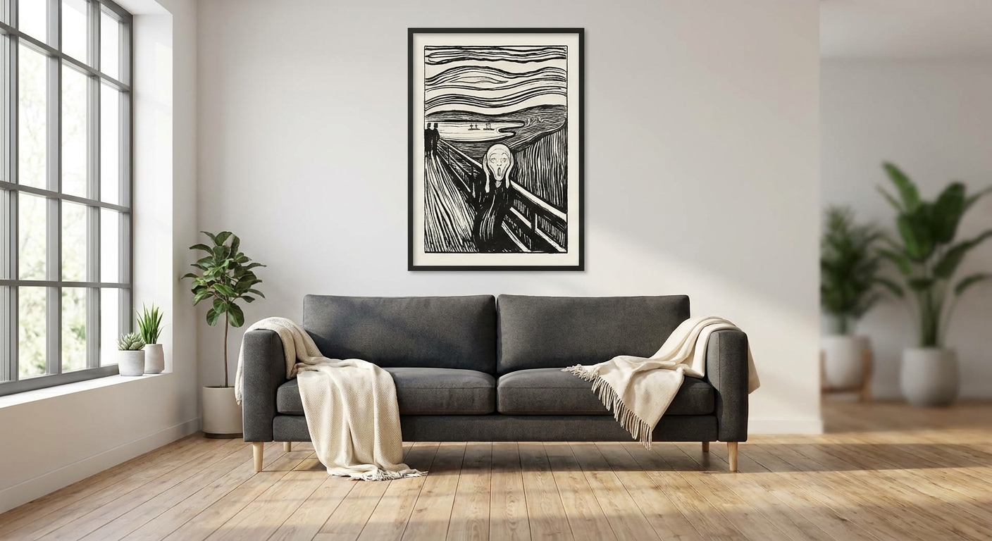
Edvard Munch's palette — fjord blues, feverish reds, sickly yellows — reads as bold and current in a 2026 interior that has moved past all-white minimalism. This guide breaks down where his prints earn a wall, where they don't, and how to hang them without turning a living room into a gallery corridor.
- Edvard Munch prints suit contemporary interiors with dark timber, deep-colour walls or Japandi contrast, not stark white minimalism.
- An oversized Scream print in a small hallway is the most common mistake seen in 2026 - Skip it, buy smaller studies instead.
- Feature walls and above-the-bed placements are the strongest fits for Munch's mood in a contemporary home - Buy for both.
- Unframed canvas of a calmer work like Melancholy reads better in shared living spaces than Scream imagery - Consider it.
Why this matters
Searches for edvard munch art run past 4,400 a month in Australia right now, and most of that demand is decorating-led, not gallery-led. People aren't buying a Munch print to study Expressionism — they're buying it because a flat, beige living room needs one wall with actual feeling in it.
That's the opportunity and the trap. Munch's work is loaded — psychological, moody, occasionally unsettling — and dropping it into the wrong room reads as a poster from a dorm room rather than a considered piece of interior design. Gioia Wall Art's curated collection leans into curated pairings for exactly this reason: the print matters less than where and how it's placed.
Who this is for
This is for someone furnishing a contemporary space — dark timber floors, matte black fixtures, maybe a Japandi or industrial-loft base palette — who wants one wall to carry emotional weight instead of another neutral abstract. It's not for anyone chasing a soft, resale-safe, universally-liked living room. Munch doesn't do universally liked. That's the point.
What to look for in Edvard Munch prints for contemporary interiors
Colour temperature and undertone
Munch's works split roughly into cold (fjord blues, greys, sickly greens) and hot (the burnt orange sky of The Scream, feverish reds in Vampire). Match the undertone to your existing palette or the print fights every other surface in the room. A cold-toned Munch against warm oak flooring and brass fittings creates tension instead of contrast — check swatches against your actual timber before committing.
Scale relative to the wall
A feature print should fill roughly 70-80% of the wall width it's hung on — anything smaller looks like an afterthought, anything bigger overwhelms the furniture line beneath it. Munch's most recognisable compositions read as busy at small sizes; they need real square footage to hold their detail.
Framing for a contemporary feel
Ornate gold or baroque framing undercuts the rawness that makes Munch's work feel current in 2026. A slim black frame or unframed stretched canvas keeps the piece feeling like a deliberate design choice rather than a museum-gift-shop purchase.
Subject matter and mood control
The Scream is instantly recognisable and instantly a cliché in the wrong hands. Quieter works — Melancholy, The Sick Child, Starry Night — carry the same palette and emotional register without the meme-level familiarity, and they sit better in rooms where guests actually spend time.
Canvas vs framed print vs paper
Canvas absorbs the moodier tones without glare and suits a feature wall at distance. A framed print under glass reads sharper up close, which matters more in a hallway or above a desk than across a living room. Pick the format based on how far away most people will actually stand from it.
Where Edvard Munch prints actually work
The safe pick — the feature wall. A single oversized Munch-style piece scaled to 70-80% of the wall's width anchors a contemporary living room without needing a second piece to balance it. This is the placement that forgives a bold colour choice because there's nothing competing with it. Pair it with the guidance on statement wall art for a feature wall before you commit to size. Buy.
The wildcard — above the bed. Munch's night scenes and cooler-toned works suit a bedroom that's trying to skip beige altogether. Hang the print with 15-20cm of clearance above the bedhead so it reads as intentional rather than crowded, and expect it to divide opinion among guests who prefer a calmer palette for sleep. Check sizing against the room in the wall art above the bed guide first. Consider it if you're the kind of household that doesn't mind a strong mood in the bedroom.
The conversation starter — dining room. A dining wall under 2m wide gets crowded fast by anything larger than one well-scaled print, so pick a single hot-toned Munch work and let it do the talking against a warm timber table. The contrast between fevered colour and everyday dinner conversation is the whole appeal. See the options on wall art for dining rooms for sizing against typical Australian dining spaces. Buy for hosts who want guests to ask about the art.
The one to skip — kids' rooms and nurseries. Munch's subject matter, even the calmer pieces, carries psychological weight that has no place in a child's room, and The Scream specifically has enough cultural baggage as a meme that it reads as a joke rather than decor to a lot of visitors. Skip this placement entirely and save the moody palette for adult spaces.
“If a Munch print doesn't unsettle the room a little, it's the wrong print for a feature wall.”
What to avoid
- An oversized Scream poster in a narrow hallway — the composition needs breathing room a corridor can't give it, and at that scale it reads as dorm-room decor rather than a considered contemporary print.
- Ornate gold or baroque frames — they fight the rawness that makes Munch's work feel current in 2026; a slim black frame or raw canvas edge does more with less.
- A full series across one small wall — grouping three or four Munch pieces together in a room under 3sqm turns a statement into visual noise. Pick one piece and commit to it.
Verdict comparison
| Placement | Mood | Commitment level | Verdict |
|---|---|---|---|
| Feature wall (living room) | Bold, anchoring | High — one piece does all the work | Buy |
| Above the bed | Moody, cooler tones | Medium — divides opinion | Consider |
| Dining room | Hot-toned, conversational | Medium — best in one piece | Buy |
| Kids' room / nursery | Heavy, psychological | N/A | Skip |
FAQ
What's the best Edvard Munch print for a contemporary living room?
A single oversized print scaled to 70-80% of the feature wall's width works best in a contemporary living room. Cooler-toned works pair with dark timber and matte black fixtures; hot-toned pieces suit a warmer, terracotta-leaning palette.
Is Edvard Munch wall art too dark for a small apartment?
It's not too dark as long as you scale it down and limit yourself to one piece per room. A single well-sized print reads as a deliberate choice in a small apartment; two or three crowded together reads as clutter.
Should I buy a framed or unframed Edvard Munch print?
Unframed canvas suits a feature wall viewed from across a room because it absorbs the moodier tones without glare. A framed print under glass reads sharper up close, which matters more in a hallway or above a desk.
How much does an Edvard Munch print cost in 2026?
Pricing depends on size, canvas versus framed, and paper quality, so it's worth comparing options directly on the collection page rather than assuming one price fits every room. Larger feature-wall sizes cost more than a smaller framed piece for a hallway.
Is The Scream too cliché to hang at home?
The Scream carries enough meme-level familiarity in 2026 that it reads as a joke to a lot of visitors rather than considered decor. Quieter works like Melancholy or The Sick Child carry the same palette without the baggage.
Can Edvard Munch prints work in a minimalist Japandi interior?
Yes, cooler-toned Munch works pair well with Japandi's muted palette and natural timber as long as you keep the frame slim and the piece to one per room. The contrast between calm surroundings and an emotionally loaded print is the appeal.
What size Edvard Munch print suits a queen bed?
Aim for a print with 15-20cm of clearance above the bedhead and width roughly matching the bed frame itself. Going smaller looks like an afterthought above a queen or king-size bed.
Are Edvard Munch prints better than Van Gogh prints for a moody room?
Neither is objectively better — Munch skews psychological and Nordic, Van Gogh skews warmer and more textured, so the choice comes down to which palette matches your existing room. Both work in a contemporary space when scaled and framed correctly.
One last thing
The piece most people skip over is Munch's Starry Night — not the Van Gogh one — which carries the same cooler palette as The Scream without any of the cultural baggage, and it's the easiest single print to hang in a contemporary living room without anyone reaching for the meme comparison first.


