
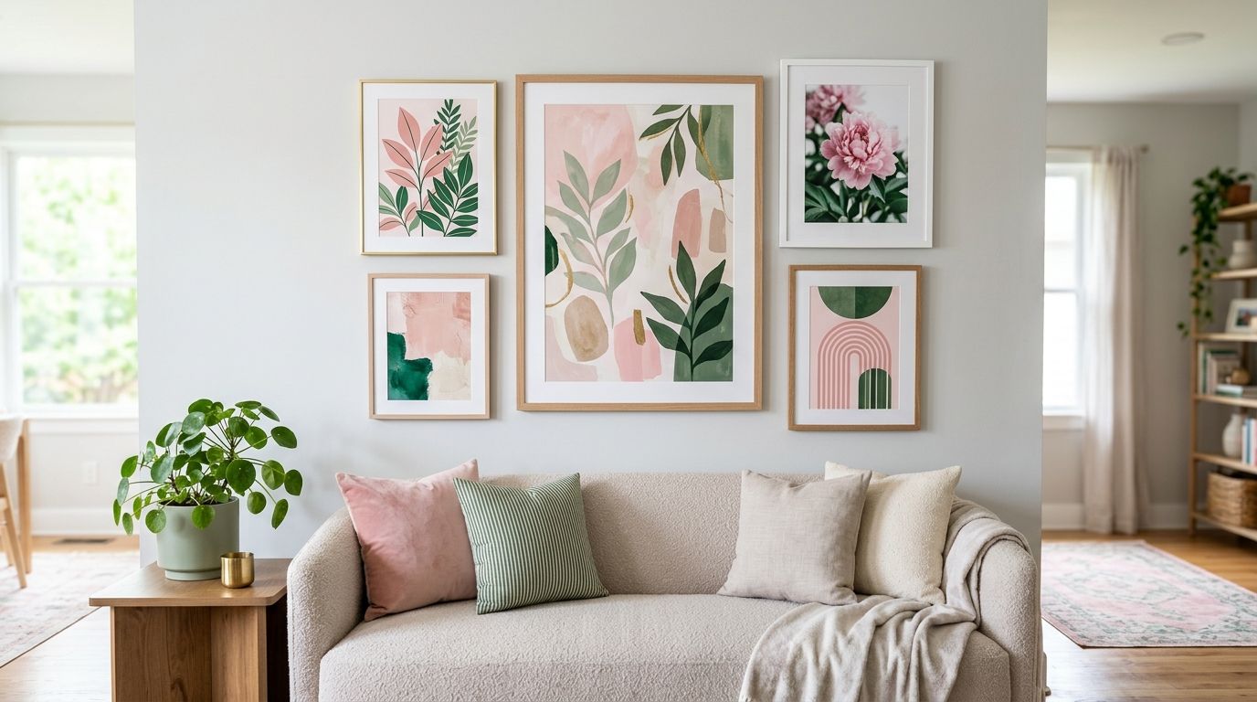
Pink and green wall art for a modern living room pairs a soft blush, rose or terracotta-pink with a leafy sage, olive or emerald green to build a palette that feels current without tipping into nursery territory. This segment wants something specific: a print that reads grown-up and design-led, works against an existing neutral sofa, and doesn't scream 'craft project' the way mismatched pastels can.
- Pink and green wall art works best in 2026 living rooms when one tone leads and the other supports — not a 50/50 split.
- Sage, olive and emerald green pair more reliably with dusty pink or terracotta than bright kelly green does.
- Canvas prints suit large open-plan walls; framed and unframed prints suit gallery-style groupings.
- Match the green in your print to your existing plants or cushions before you match the pink to anything.
Why this matters
Sage-and-blush and olive-and-terracotta pairings have held steady as an interior palette through the shift away from all-grey living rooms, and they show up constantly in the Hamptons, Japandi and Coastal Luxe looks that Gioia Wall Art styles around. The catch is that pink and green is one of the easier combinations to get wrong: too much saturated pink next to too much cool green reads like a 1980s powder room, not a 2026 living room.
The fix isn't a rulebook — it's a handful of decisions made in the right order. Get the undertone right first, then the split, then the frame, and the room does the rest of the work.
Anchor the palette with one dominant print
Pick a single large-format piece as the palette's anchor before you add anything else. Every other pink or green item in the room should read as a supporting note to this one print, not compete with it.
- Choose a piece where either pink or green clearly leads — aim for roughly 70/30, not an even split
- Size the anchor print to at least two-thirds the width of the furniture it hangs above
- Pick a botanical, abstract or landscape subject over a busy pattern for the anchor spot
- Hang it first, then bring in cushions, throws and smaller prints to match
Balance warm pink against cool green
Most pink-and-green combinations fail because the pink runs warm (coral, terracotta, dusty rose) while the green runs cool (mint, teal-green), or the reverse. Get the temperature matching right and the palette holds together in almost any light.
- Pair warm pinks (terracotta, blush, dusty rose) with warm greens (olive, moss, sage)
- Pair cooler pinks (magenta, fuchsia) with cooler, more saturated greens (emerald, forest)
- Avoid pairing a warm pink with a cool blue-green — it's the most common clash in this combination
- Check the print in daylight and again under evening lamp light before committing to a wall placement
Test undertones against your existing sofa and walls
A print that looks perfect on screen can clash badly against a wall colour or sofa fabric with the wrong undertone. This step catches problems before a canvas is hanging and impossible to return.
- Hold a printed swatch or photo against your sofa fabric in natural daylight
- Note whether your walls run warm white, cool white or a mid-tone neutral
- Check the print again at night under your main living room lighting
- If your sofa is a warm beige or terracotta, lean the print's pink warmer to match
Layer in botanical prints for a natural pink-green link
Floral and botanical subjects are the easiest route into this palette because pink and green already coexist in nature — a print of eucalyptus with pink gum blossom does the matching work for you. Botanical wall art for plant lovers covers this ground in more depth if leafy prints are your starting point rather than an accent.
- Use a botanical print as the anchor if you want the palette to feel organic rather than graphic
- Add one abstract or line-art piece alongside it so the wall doesn't read as purely floral
- Repeat the print's exact green in at least one indoor plant nearby
- Keep botanical prints framed rather than unframed in a living room — the frame reads more finished on a feature wall
Match the wall art to your sofa and rug, not the other way around
Work from the biggest fixed items in the room outward. A sofa and rug are harder and more expensive to change than a print, so the print should adapt to them — matching wall art colours to your sofa walks through this in full if your sofa colour is the fixed starting point.
- Pull the print's secondary tone from your rug rather than your cushions
- If your sofa is neutral (grey, oatmeal, white), the print can run bolder on both pink and green
- If your sofa already carries pink or green, keep the print's version of that colour one shade lighter or darker, not identical
- Avoid choosing a print that matches cushions exactly — it reads as a matching set rather than a considered room
Choose a frame finish that keeps the look modern
Frame choice moves this palette from 'sweet' to 'considered' faster than almost any other decision. A thin black or natural timber frame keeps blush-and-sage from tipping into overly soft territory.
- Black frames sharpen a soft palette and suit a contemporary or Scandinavian living room
- Natural oak or timber frames suit a warmer, more Japandi-leaning room
- Skip ornate gold or white-washed frames — they push the combination toward a more traditional, less 2026 look
- Unframed canvas works well for the anchor print if the rest of the room already carries frames elsewhere
Scale the print correctly for your wall
Undersized art is the single fastest way to make a considered colour palette look accidental. A pink-and-green print that's too small for its wall reads like leftover art rather than a deliberate feature.
- Above a sofa, aim for a print roughly 60-75% of the sofa's width
- On a feature wall with no furniture reference, size to fill roughly two-thirds of the visible wall space
- For a gallery grouping, treat the whole cluster as one shape and size it the same way
- When in doubt, size up — a slightly oversized print reads more intentional than an undersized one
Comparison: which format suits your room
| Option | Best for | Key limitation |
|---|---|---|
| Canvas print | Large open-plan living rooms, above-sofa anchor pieces | Limited to the exact size and crop the design was created at |
| Framed print | Gallery walls, rooms wanting a crisper, more graphic edge | Adds visual weight — needs more wall space to breathe |
| Unframed print | Renters, rooms where you plan to custom-frame later | Needs a frame purchased separately before hanging |
| Removable wallpaper | A single feature wall carrying the whole palette | Best suited to one wall only — busy in a full room |
Verdict: for a living room feature wall, a large botanical or abstract canvas print carrying one dominant tone (pink or green, not both equally) is the most reliable pink-and-green choice for 2026 — it anchors the palette without needing every other item in the room to match it exactly.


Common mistakes with pink and green living rooms
- Choosing baby pink with kelly green — this exact pairing reads as a nursery, not a living room, no matter how good the print's composition is
- Splitting the palette 50/50 — an even mix of pink and green with no lead colour makes the wall feel busy instead of styled
- Ignoring undertone under evening light — a print that balances perfectly in daylight can shift and clash once warm lamp light hits a cool green
- Sizing the print to the cushions instead of the wall — a small print that matches soft furnishings but not the wall scale looks like an afterthought
- Skipping the frame decision — an ornate or overly rustic frame pulls a modern pink-green palette back toward a dated, overly sweet look
FAQ
Does pink and green wall art work in a small living room?
Yes, pink and green wall art works in a small living room if you keep one tone dominant and size the print correctly rather than adding several small pieces. One well-scaled canvas print does more for a small room than a gallery cluster of mismatched sizes.
What shade of green pairs best with pink wall art?
Sage, olive and moss green pair most reliably with dusty pink and terracotta because both sit in the same warm-toned family. Bright kelly or emerald green needs a cooler pink, like magenta or fuchsia, to avoid clashing.
Is pink and green wall art too bold for a modern living room?
It isn't too bold as long as one colour leads and the frame stays simple — black or natural timber rather than ornate gold. Reserved slightly, an unframed or thin-framed canvas keeps the palette modern rather than loud.
Should I match the wall art to my sofa or my cushions?
Match the print to your sofa and rug first since those are harder to change, then let cushions follow the print rather than the reverse. This keeps the room from reading as an overly matched set.
Can I use pink and green wall art with a grey or neutral sofa?
A grey or neutral sofa is the easiest base for pink and green wall art because it doesn't compete with either colour. It also lets the print run bolder on both tones without the room feeling overloaded.
What's the difference between botanical and abstract pink-green prints?
Botanical prints use pink and green as they occur in nature — blossoms, leaves, gum foliage — so the pairing feels effortless. Abstract prints separate the two colours into shapes or blocks, giving a more graphic, considered look for a contemporary room.
Do I need a frame for pink and green canvas art?
Canvas prints in this palette are typically sold gallery-wrapped and don't need a frame, which suits a softer, more organic room. A framed print is worth choosing instead if the rest of your living room already carries framed pieces.
One last thing
The pink-and-green pairings that hold up longest in 2026 living rooms are the ones where the green comes from a botanical subject rather than a flat colour block — it ties the wall art back to whatever plants are already in the room, which a painted green panel never does. If you're staring at a print trying to decide whether it's too much, check the ratio first: 70/30 pink-to-green or green-to-pink almost always reads better than an even split.


