
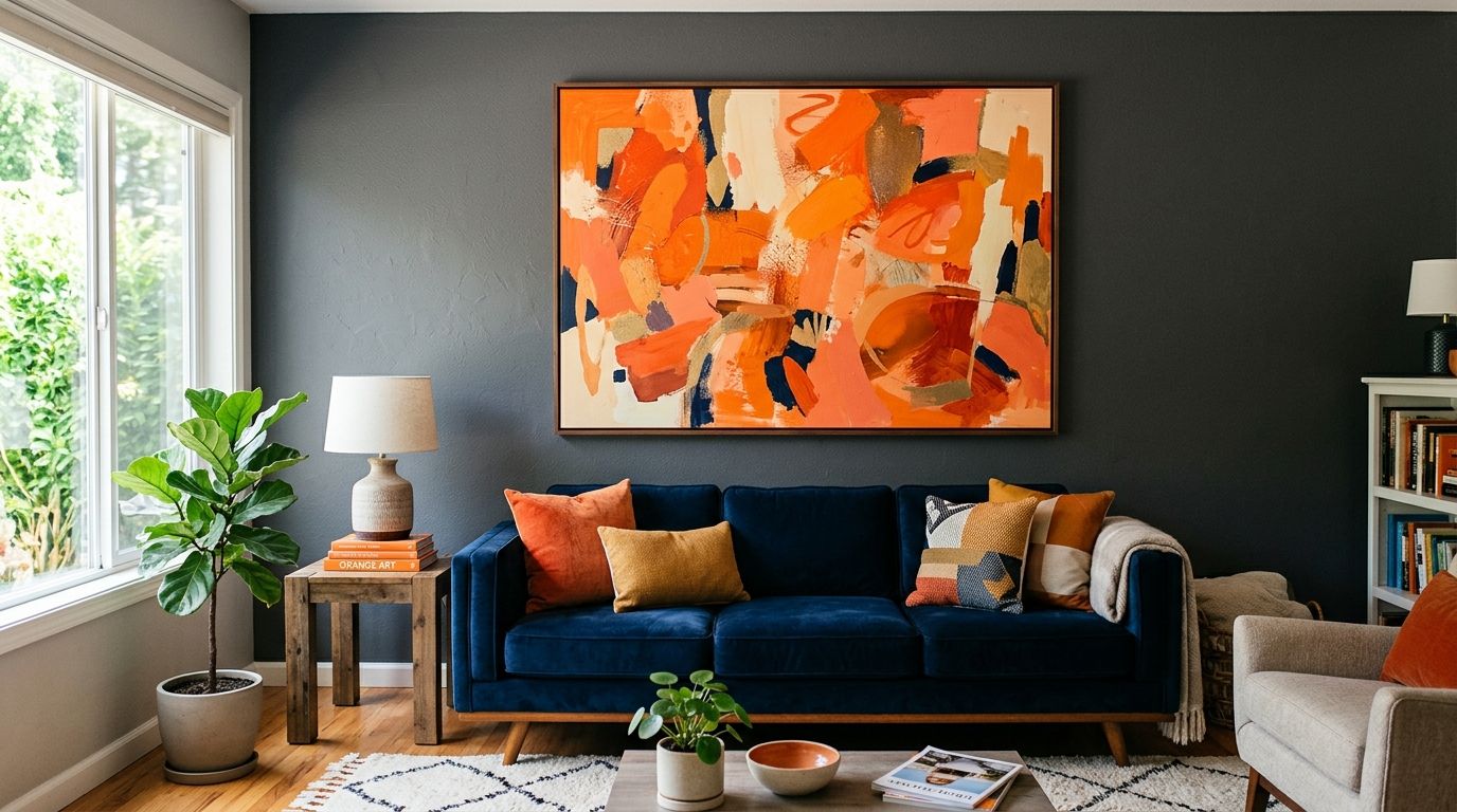
Orange wall art for a bold, energetic living room is the fastest way to turn a plain wall into the room's focal point without repainting a single surface. This colour reads warm, confident and a little unexpected next to timber floors, brass fixtures and deep-toned sofas that dominate 2026 interior schemes. Unlike a neutral gallery wall, orange art has to work with your existing furniture's undertone, not just sit on top of it as decoration.
- Orange wall art works best as one statement piece above the sofa, not scattered across multiple small prints.
- Match the orange's undertone (red-leaning vs yellow-leaning) to your flooring and upholstery before buying.
- A canvas print scaled to two-thirds of your sofa's width reads as intentional, not accidental.
- Terracotta and burnt-orange tones pair more reliably with Australian timber floors than pure citrus orange.
- Test any orange print against your actual living room light for at least a full day before committing.
Why orange wall art matters for a bold living room
A bold, energetic living room is usually built around one or two loud furniture choices — a burnt-orange sofa, a patterned rug, a brass floor lamp — and the wall behind them either supports that energy or competes with it. Plain white walls in these rooms often look unfinished because there's nothing pulling the palette together. Orange wall art solves that by repeating the room's warmest tone at eye level, which is why pop art wall prints for bold, colourful homes and terracotta-toned pieces sell well together in the same rooms.
This segment isn't chasing subtlety. People shopping for orange wall art in 2026 are usually already committed to a maximalist or Mid-Century-adjacent scheme and want the art to match that confidence, not soften it. The brief is different from someone buying a calming abstract print for a bedroom — here the art has a job to do: hold the room's energy without turning it into a colour clash.
Choose your orange undertone first
Orange isn't one colour — it's a spectrum from pale peach to deep rust, and the wrong undertone next to warm oak flooring or a cool grey sofa will fight the room instead of finishing it.
- Hold a paint swatch or printed sample against your flooring in daylight, not under artificial light
- Match red-leaning oranges (terracotta, rust, burnt sienna) with warm timber and leather
- Match yellow-leaning oranges (marigold, tangerine) with lighter oak or Scandinavian-style furniture
- Avoid pure fluorescent orange unless the room already has a strong graphic or pop-art theme
- Photograph the swatch on your phone under both daytime and evening lamp light to check consistency
Anchor the room with one statement piece above the sofa
A single large canvas does more work than five small prints scattered across the wall, especially in a room that already has a lot going on visually.
- Measure your sofa's width and aim for artwork that spans roughly two-thirds of it
- Hang the piece so its centre sits at eye level, roughly 145-155cm from the floor
- Leave 15-20cm between the top of the sofa and the bottom of the frame
- Check the above-the-sofa styling guide before you commit to final dimensions
Pair orange with a grounding neutral
Orange on its own, without a visual break, can start to feel like a themed room rather than a designed one. A neutral buffer — in the frame, the mat, or the wall colour itself — keeps the statement from tipping into overload.
- Choose a black or natural timber frame over a bright white one for a heavier, more grounded look
- Add a cream or charcoal cushion on the sofa to give the eye somewhere to rest
- Keep the rug pattern simple if the wall art is already busy
- Let one wall carry the colour and keep adjacent walls neutral
Layer texture before you add more colour
Bold rooms age well when texture does some of the visual work instead of stacking on more colour. A hand-finished canvas, a linen mat, or a rougher timber frame reads as more considered than flat gloss everywhere.
- Mix a matte canvas finish with a glossy coffee table or metallic lamp for contrast
- Add a woven throw in a muted tone rather than another bright pattern
- Use a textured original painting instead of a flat print if the budget allows
- Balance one high-texture item per wall so nothing competes for attention
Test the shade in your actual light
Orange shifts more under artificial light than almost any other wall colour, and a print that looks perfect on screen can read orange-red under warm downlights or washed-out under cool LEDs.
- View any print listing photos taken in both natural and artificial light
- Order a smaller print first if you're unsure, then scale up once you've seen it on the wall
- Check your room faces north or east for stronger natural light exposure, which intensifies warm tones
- Reassess after 48 hours — first impressions under new lighting conditions often change
Scale the art to the wall, not the sofa
A wall with high ceilings or an open-plan layout needs more than one modestly sized print to hold its own. Undersized art is one of the most common reasons a bold room still looks unfinished.
- Measure the full wall, not just the furniture in front of it
- In open-plan living rooms, consider a diptych or triptych to stretch the visual width
- For rooms with ceilings above 2.7m, oversized canvas prints hold proportion better than a cluster of small frames
Introduce accent orange through smaller pieces if full-scale feels risky
Not every household wants to commit an entire feature wall to one colour. A smaller framed print or an unframed poster lets you test the palette before scaling up.
- Start with one A2 or A1 unframed print in a low-commitment spot like a reading nook or hallway
- Move to canvas only once you're confident the tone works with your existing furniture
- Rotate seasonal or smaller prints if you want to change the energy without repainting
Comparing your options for orange wall art
| Option | Best for | Key limitation |
|---|---|---|
| Large canvas print | A single statement piece above the sofa | Needs a genuinely large wall to avoid looking oversized for the room |
| Framed art print | Households wanting a more formal, gallery finish | Glass or acrylic glazing can create glare under bright orange tones |
| Unframed poster | Testing a shade before committing, or rental walls | Less durable long-term and shows wear faster than canvas |
| Original painting | Buyers wanting texture and a one-off piece | Fewer size and colour-matching options than a printed canvas |
| Peel-and-stick wallpaper accent | A full feature wall rather than a single artwork | Best suited to a dedicated accent wall, not a small gallery cluster |
Verdict: a single oversized canvas print in a terracotta or burnt-orange tone, hung above the sofa at two-thirds its width, is the most reliable way to anchor a bold, energetic living room without it tipping into visual clutter.
If terracotta feels closer to what you're picturing than pure orange, the terracotta and warm earthy wall art collection covers that softer end of the same palette. And if you're still unsure which shade will actually sit well against your existing sofa, the guide on choosing wall art colours that match your sofa walks through the undertone-matching process step by step.
Common mistakes with orange wall art in a bold living room
- Going fully matchy — orange sofa, orange art and orange cushions in the same exact shade reads flat rather than curated. Break it up with at least one neutral layer.
- Undersizing the artwork — a 60x90cm print on a wall built for a 3-metre sofa disappears instead of anchoring the room.
- Ignoring undertone clash — a yellow-leaning orange print against a cool grey concrete floor or steel-framed furniture creates visible tension rather than warmth.
- Skipping the neutral buffer — no black, cream or charcoal element in the frame or nearby furnishings, so the whole wall competes for attention at once.
- Buying before checking the light — a print chosen from a screen photo taken in daylight can shift noticeably under evening lamp light in a south-facing room.
FAQ
What's the best orange wall art for a small living room?
A single, well-scaled unframed print or a smaller canvas in a muted terracotta tone works best in a small room, since a full oversized canvas can overwhelm limited wall space. Keep the surrounding furniture and frames neutral to stop the space feeling busy.
Is orange wall art too bold for a rental property?
No — an unframed poster or peel-and-stick wallpaper accent lets you commit to the colour without altering the walls permanently. Both are easy to remove at lease end, unlike a painted feature wall.
Does orange wall art work with a grey sofa?
Yes, as long as the orange leans warmer (rust or terracotta) rather than pure citrus, since cool grey needs a warm-toned counterpart rather than a competing cool one. A black or timber frame helps bridge the two tones.
How big should orange wall art be above a sofa?
Aim for artwork spanning roughly two-thirds of the sofa's width, centred at eye level around 145-155cm from the floor. Oversizing slightly is safer than undersizing in a bold, energetic room.
What's the difference between terracotta and orange wall art?
Terracotta is a muted, red-leaning shade of orange with more brown in it, while pure orange is brighter and more saturated. Terracotta tends to sit more comfortably with Australian timber flooring and earthy interiors.
Can I mix orange wall art with other bold colours in the same room?
Yes, but limit it to one other strong colour and keep the rest of the room neutral, or the wall will compete with the furniture instead of framing it. Deep green or navy are the most reliable pairings with orange.
Should orange wall art be framed or unframed?
Framed prints give a more finished, gallery look and suit permanent homes, while unframed posters are cheaper to test and easier to swap out. Canvas prints need no framing at all and are the most common choice for a statement piece.
Does orange wall art fade in direct sunlight?
Any printed artwork can fade with prolonged direct sun exposure, so north-facing or unshaded walls need UV-protective glazing or placement out of direct light. Rotating or repositioning pieces periodically also reduces uneven fading.
One last thing
The undertone test matters more than most buyers expect: the exact same orange canvas can look rust-red under warm 2700K downlights and noticeably more yellow under daylight-balanced 4000K bulbs. Before hanging anything permanently, prop the piece against the wall for 24-48 hours and check it morning, afternoon and evening — the shade that reads best under all three is the one that will actually work in 2026 and beyond, not just in the listing photo.


