
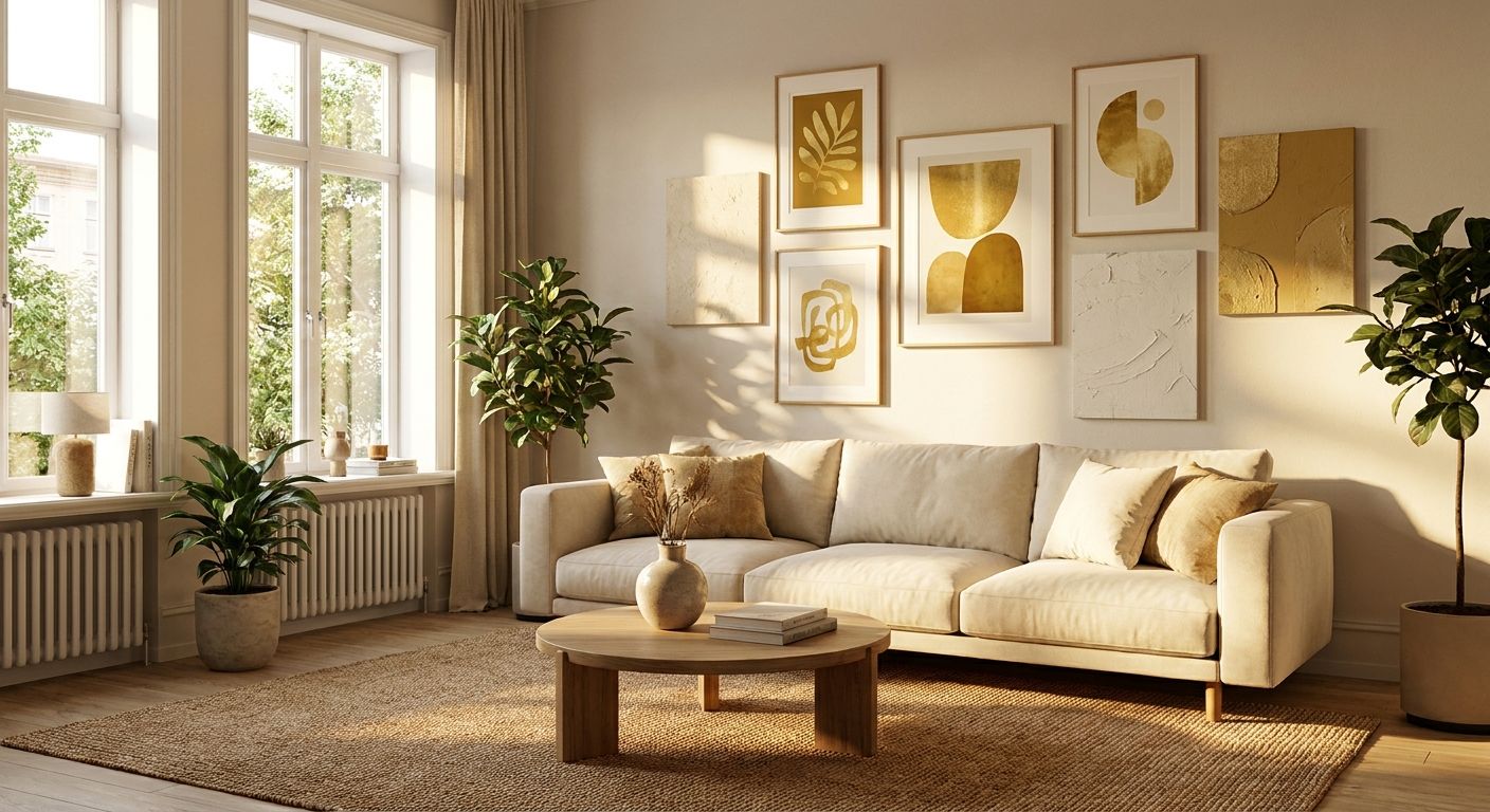
Gold and mustard wall art for a warm, sunlit living room works because both pigments hold their depth under direct light instead of washing out the way pale blues and greys can by mid-afternoon. In a room that already gets hours of sun, a mustard or ochre print reinforces the warmth already in the space instead of fighting it, giving the room a layered, lived-in feel rather than a bleached one. The tone also sits close to the warm timber, terracotta tile and brass fixtures that show up in Hamptons and Japandi living rooms across Australia in 2026, which is part of why the pairing keeps turning up in renovation photos.
- Gold and mustard wall art holds its saturation under direct sun far better than cool-toned blue or grey prints, which wash out by mid-afternoon.
- Canvas prints in mustard tones fade fastest in direct midday sun; UV-filtering glazing or a north-facing wall position slows the shift.
- Pair one dominant gold-toned piece with terracotta, olive or charcoal accents instead of covering more than one wall in mustard.
- Gioia Wall Art's canvas and framed prints span warm tones from honey through deep ochre for exactly this kind of room.
- A print 90cm or wider above the sofa reads as a feature wall; smaller pieces get lost in a sunlit, high-ceiling room.
Why gold and mustard wall art matters for a sunlit living room
A living room with big north- or west-facing windows fights a different battle than a shaded one: direct sun bleaches cool-colour prints and throws harsh contrast onto stark white or black frames. Gold and mustard wall art sits in the same warm register as afternoon light, so it blends into the room instead of competing with it. Sunlit rooms also tend to carry warm-toned floors already - light oak, blonde timber or terracotta tile - which is exactly the register a gold or mustard print echoes.
Sustained UV exposure degrades warm pigments faster than blues, so before hanging anything larger than 60cm on a wall that gets four-plus hours of direct sun, protect canvas prints from sun fading with UV-filtering glass or careful placement. That single step decides whether the print still looks right in a couple of years or needs replacing early.
The undertone matters as much as the colour name. A mustard that leans olive photographs differently under a north-facing skylight than under a west-facing window that only gets direct sun for two hours before sunset. Stylists working in Hamptons, Coastal Luxe and Scandinavian schemes treat gold and mustard as a warm neutral rather than a bold statement colour, which is why it keeps turning up alongside white oak floors and linen upholstery in 2026 renovation projects.
None of that changes the physics of direct sun on pigment. A wall that gets four hours of unfiltered afternoon light will still test a print's lightfastness faster than a shaded reading nook, regardless of how well the colour suits the room on paper.
How to choose gold and mustard wall art for a sunlit living room
Six checks separate a gold or mustard print that still looks considered in a few years from one that fades unevenly or clashes with everything added to the room afterwards. Work through them in order, starting with the wall itself rather than the artwork.
Test your wall's actual light exposure
Don't guess from memory - the same wall reads differently at 11am and 4pm, and that gap matters more in a genuinely sunlit room than it does in a shaded, north-facing living room.
- Track sun exposure on the target wall between 11am and 3pm for a week before choosing a size or finish.
- Note whether light hits the wall directly or bounces off a mirror, glass table or tiled splashback - reflected light intensifies fading.
- Check the wall's undertone under daylight versus lamp light; mustard reads more orange under warm LED, more yellow under natural light.
- Photograph the wall at midday and dusk to compare how existing decor colours shift across the day.
Anchor your palette around one dominant undertone
- Pick either a warm gold (leaning amber or orange) or a cooler mustard (leaning olive or khaki) - mixing both in one room reads busy.
- Match the undertone to existing textiles: warm gold suits terracotta and rust cushions; mustard suits olive and charcoal.
- Limit gold or mustard to one wall or one large piece, then carry the tone through cushions or a throw elsewhere.
- If the sofa is already mustard or ochre, choose wall art in a complementary tone rather than matching it exactly.
- Keep any secondary gold accents (a vase, a frame edge) in the same undertone family so nothing reads as a mismatched yellow.
Size the print for a sunlit, high-ceiling room
- Aim for a print roughly two-thirds the width of the furniture it sits above.
- For a sofa run of 200cm or more, go no smaller than 90cm wide on the single largest piece.
- In a room with ceilings above 2.7m, one large canvas reads calmer than a cluster of small frames.
- For a gallery-style layout instead of one large piece, keep at least three frames in the same gold or mustard family so the grouping doesn't fragment.
Shield the print from direct UV before you hang it
The free fix is positioning and glazing - no product purchase required for this step, just planning ahead of hanging day.
- Hang the print perpendicular to the window rather than directly opposite it, which cuts direct exposure by roughly half.
- Add a sheer curtain or UV window film if the room gets more than four hours of unfiltered sun.
- Rotate cushions and smaller prints seasonally so nothing sits in the same sun patch for a full year.
- Choose a framed print with glass or acrylic glazing over raw canvas if the wall faces west - Gioia Wall Art's framed range gives you that glazing built in, without sourcing separate UV film.
Pair mustard and gold with the right neighbouring colours
- Terracotta, burnt orange and rust deepen a mustard piece without competing with it.
- Charcoal, black or deep navy furniture grounds a gold print so the room doesn't tip into yellow overload.
- Olive green and sage work as a cooler counterpoint if the mustard leans warm.
- Avoid pairing mustard with another strong warm tone like coral or hot pink in the same sightline - two competing warms cancel each other out.
Match wall art colours to what's already in the room
- Pull one undertone from the existing sofa or rug fabric and use it as the bridge colour in the print.
- If the furniture is neutral - grey, beige or white - gold or mustard wall art becomes the room's only accent colour, so keep it to one piece.
- Match wall art colours to your sofa before ordering if it's unclear whether warm gold or cooler mustard suits the existing palette better.
- Test a printed swatch or a photo against the cushions in the actual room light, not under shop lighting.
Which format works best for gold and mustard wall art
Gioia Wall Art carries gold and mustard tones across several formats, and each suits a different sunlit-room problem rather than one being universally better.
| Option | Best for | Key limitation |
|---|---|---|
| Canvas print | Large feature walls above a sofa | No UV barrier unless a protective coating is specified |
| Framed print | West-facing rooms with strong afternoon sun | Glass adds weight, so it needs a stud or wall anchor |
| Unframed art print | Renters wanting to swap tones seasonally | No UV protection at all - must stay out of direct sun |
| Peel-and-stick wallpaper accent | A full feature wall without one large print | Busy patterns can look overwhelming in a small room |
| Original painting | A one-off statement piece in gold or mustard | Can't be reordered in a second colourway if the room changes |
For most sunlit living rooms, a framed print earns its place because the glazing is already doing the UV work; canvas suits a wall that only gets filtered or indirect light for most of the day.


Common mistakes people make with gold and mustard wall art
- Covering more than one wall in mustard. One accent wall reads as styled; two reads like a paint sample gone wrong, and it flattens the contrast that made the tone interesting in the first place.
- Choosing a print from a screen instead of the actual room. Mustard on a phone screen under artificial light looks nothing like mustard on a west-facing wall at 2pm.
- Undersizing the piece. A 40cm print above a three-seat sofa disappears in a sunlit room with high ceilings, no matter how good the artwork is up close.
- Skipping UV consideration entirely. Hanging an unframed print directly in a sunbeam fades the pigment within a couple of years, long before the canvas or paper itself wears out.
- Matching too literally. Buying wall art in the exact same mustard as the sofa flattens the room instead of layering it - contrast is what makes the tone read as a deliberate choice rather than an accident.
“If mustard covers more than one wall, the room reads like a spice aisle, not a living room.”
FAQ
Does gold and mustard wall art suit a small sunlit living room?
Yes, as long as it's kept to one dominant piece rather than covering more than one wall. In a small room, a single 60-90cm mustard or gold print reads as a feature, while more than one wall in the same tone shrinks the space visually.
Is canvas or a framed print better for wall art in direct sunlight?
A framed print with glass or acrylic glazing handles direct sun better than raw canvas, since the glazing sits between the pigment and the UV rays. Raw canvas in full afternoon sun fades faster and has no barrier unless a protective coating is specified.
Should mustard wall art match my sofa exactly?
No - matching the exact same mustard as the sofa flattens the room instead of layering it. A complementary tone like terracotta, charcoal or olive reads as a considered accent rather than a duplicate.
How large should gold or mustard wall art be above a sofa?
Aim for roughly two-thirds the width of the sofa, which means at least 90cm wide for a three-seat sofa around 200cm. Undersized prints get lost on a sunlit wall with high ceilings.
Does mustard fade faster than other wall art colours?
Warm pigments like mustard and gold do shift under sustained direct UV exposure faster than some cooler blues, though the rate depends on print medium and glazing. Positioning the piece out of direct midday sun or choosing UV-filtering glass slows the fade.
What colours pair best with gold and mustard wall art?
Terracotta, rust, charcoal and olive green all work as neighbouring tones without competing with mustard or gold. Avoid pairing it with another strong warm colour like coral or hot pink in the same sightline.
Is peel-and-stick wallpaper a good alternative to a large mustard print?
Peel-and-stick wallpaper works well for a full feature wall in a warm pattern without committing to one large framed piece, and it suits renters who can't drill into walls. The trade-off is that busy patterns can look overwhelming in a smaller room.
One last thing
The biggest give-away of a rushed mustard accent wall isn't the tone, it's the sheen. A high-gloss mustard print under direct sun throws glare across the room by early afternoon, while a matte or lightly textured canvas absorbs that same light instead of bouncing it back at visitors. Gioia Wall Art's matte canvas finishes avoid that glare entirely, which matters more in a genuinely sunlit living room than the exact shade of gold chosen. Check the finish before the frame - it decides whether the wall reads considered or accidental in a 2026 renovation.


