
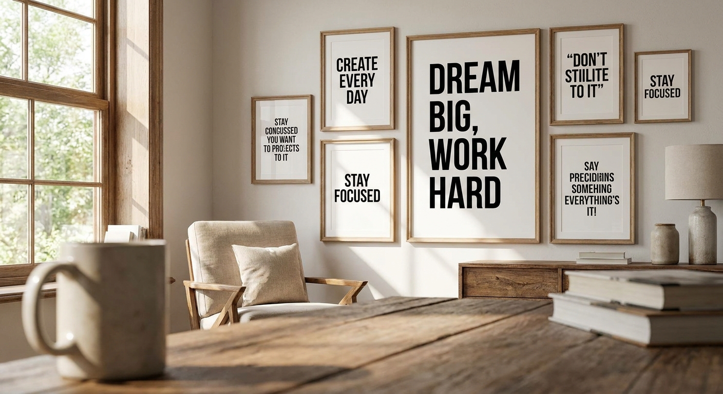
Typography wall art turns a wall into a daily prompt — a phrase you read on the way to the kettle, the gym mat, or the desk chair, whether you clock it or not. Get the font, size, and placement wrong and it becomes wallpaper noise; get it right and it does actual work on your mood and focus.
- Typography wall art for home offices works best with short, high-contrast phrases on canvas, not gloss — Buy.
- Skip script fonts in gyms and hallways in 2026; sans-serif reads faster from across a room.
- Framed quote prints suit corporate offices; unframed canvas suits gyms and reading nooks — different verdicts, same category.
- Size to sightline distance, not wall space — a 60x90cm print reads clearly from three metres away.
Why this matters
A motivational space only works if the message registers in under two seconds — that's roughly how long someone glances at a wall while walking past it. Typography wall art that needs a close read to decode fails the one job it has. Gioia Wall Art sees this most often in home offices and gyms, where the same quote print gets hung, squinted at for a week, then taken down because nobody actually reads it anymore.
The fix isn't a better quote. It's matching typography wall art to the room's actual sightlines, lighting, and traffic pattern — the same way you'd match a canvas print's colour to a sofa.
Who this is for
This guide is for anyone building a room meant to nudge behaviour — a home office where you need a reset before a call, a home gym corner, a studio, or a shared workspace where the wall has to do some of the motivating for you. If you're picking typography wall art purely for how it photographs on a mantel, a lot of these rules won't matter as much. If you're picking it because you want to feel something specific every time you walk past, they matter a lot.
What to look for in typography wall art for motivational spaces
Font and type style
Sans-serif type reads fastest at a glance — that's why gym and studio typography almost always leans bold, blocky, uppercase. Serif fonts feel more considered and suit quieter rooms like reading nooks or bedrooms, where you're not rushing past. Script fonts look elegant in a photo but are the slowest to decode in person, which makes them a poor fit for any space where the point is speed.
Message length and legibility at distance
A phrase under eight words works from across a room; anything longer forces a close read that defeats the point of a motivational space. Test this by standing at the room's furthest regular viewing point — the office doorway, the end of the hallway — before you commit to a print. If you can't read it clearly from there, the size or the word count is wrong, not the wall.
Color contrast against the wall
Low-contrast typography — pale grey text on off-white, cream on beige — looks tasteful in a showroom and disappears in a real room with real lighting. Motivational typography needs enough tonal separation to register in half a second, especially in spaces with mixed natural and artificial light like a home gym or a garage studio.
Framing and finish
A glossy finish under fluorescent office lighting throws glare that makes text unreadable from certain angles — a real problem in corporate offices with overhead panel lighting. Matte canvas or a framed print with anti-glare glass holds up better in bright, artificial-light rooms. Framing also changes the register: a framed quote print reads as considered and permanent, while unframed canvas reads as casual and current.
Sizing for the room's sightline
Size should scale to the distance you'll actually be standing when you read it, not to the empty wall space available. As a working rule, a print needs roughly 15-20cm of visible height for every metre of typical viewing distance to stay legible without squinting. Check how to choose the right size wall art for your wall before ordering if the room has an unusual layout or a long, narrow sightline.
If you have to squint to read it from the doorway, it's the wrong size for a motivational space.
Top picks by space
Home office — the productivity pick. A single short-phrase canvas above the monitor line, sized to be legible from the desk chair, works better than a gallery wall of mixed quotes. One clear line beats five competing ones in a room where focus is the whole point. Buy for anyone working from a dedicated desk five or more days a week in 2026.
Gym and yoga studio — the high-traffic pick. Bold, uppercase, sans-serif typography on matte canvas holds up against sweat-humidity and gets read in passing rather than studied. Wall art for gyms and yoga studios needs to survive being glanced at mid-rep, not admired at leisure. Buy for home gyms and studio corners; Skip delicate script pieces here entirely.
Corporate office — the boardroom pick. Framed typography with a matte or anti-glare finish avoids the glare problem that plagues glossy prints under panel lighting. Wall art for corporate offices benefits from a slightly more formal register than a home gym print — think values statements over slogans. Consider for shared workspaces; run it past the team first since a boardroom quote is a group decision, not a solo one.
Staircase — the everyday-passthrough pick. A staircase gets walked past dozens of times a day, which makes it a strong spot for a short phrase read in fragments across multiple trips rather than one long sit-and-read piece. Consider if the stairwell has consistent daytime light; Skip if it's a dim, windowless landing where any typography will read as a grey smudge.
Reading nook — the quiet-motivation pick. Serif type and a softer palette suit a space built for slowing down rather than powering through, which is the opposite job to a gym wall. A smaller, framed piece at eye level from the reading chair works better than an oversized statement print here. Consider for a corner chair setup; Skip an oversized bold print that fights the room's calmer purpose.
What to avoid
- Long-form quotes in high-traffic spots — a full paragraph of text looks striking in a photo and gets ignored in real life because nobody stops to read it.
- Trendy script fonts near gym or hallway traffic — they photograph beautifully and function poorly the moment someone's moving past at normal walking pace.
- Glossy finishes under strong overhead lighting — the glare defeats the entire purpose of putting words on a wall to be read.
Verdict comparison
| Space | Best font style | Size guide | Verdict |
|---|---|---|---|
| Home office | Sans-serif, short phrase | Eye level from desk chair | Buy |
| Gym / yoga studio | Bold uppercase sans-serif | Legible from across the room | Buy |
| Corporate office | Clean serif or sans-serif, framed | Eye level, matte finish | Consider |
| Staircase | Short sans-serif fragments | Sized to well-lit landing | Consider |
| Reading nook | Softer serif | Smaller, eye level from chair | Consider |
FAQ
What's the best typography wall art for a home office in 2026?
A short-phrase canvas in sans-serif type, sized to be legible from the desk chair, works best for a home office in 2026. Keep the message under eight words so it registers at a glance rather than requiring a close read.
Is typography wall art better than a framed quote print?
Neither is universally better — unframed canvas suits casual, high-traffic spaces like gyms, while a framed quote print suits formal rooms like corporate offices. The choice depends on the room's register, not on which format is inherently higher quality.
How much does typography wall art cost in Australia?
Pricing varies by size, material, and whether it's framed, so check current listings on the site for exact figures. Canvas prints are generally more affordable than framed originals in the same size range.
What font works best for motivational quote wall art?
Bold, uppercase sans-serif fonts read fastest from a distance, which makes them the strongest choice for gyms, hallways, and offices. Serif and script fonts suit quieter rooms like reading nooks where speed of reading matters less.
How big should typography wall art be for a gym?
Size the print so the text is legible from the furthest point someone regularly stands or moves through the room. As a working rule, allow roughly 15-20cm of print height for every metre of typical viewing distance.
Can typography wall art work in a small apartment?
Yes — a single, well-sized statement piece with a short phrase works better in a small apartment than multiple competing prints. Oversized text in a tight space tends to overwhelm rather than motivate.
Does typography wall art need to be framed?
No, framing is a style choice rather than a requirement — unframed canvas suits casual and high-traffic rooms, while framing suits formal spaces like offices. Anti-glare glass matters more than the frame itself under strong overhead lighting.
What colour typography wall art works in most rooms?
High-contrast combinations — dark text on a light ground or the reverse — read clearly in most lighting conditions and room styles. Low-contrast pairings like pale grey on cream look refined in photos but disappear in everyday light.
One last thing
The single biggest mistake in typography wall art for motivational spaces isn't the phrase — it's hanging it at a height suited to a seated photo shoot rather than the actual sightline of someone standing, walking, or mid-workout. Measure from where you'll actually be when you read it, not from the wall's centre point, and the same print will do noticeably more work in 2026 than it did on the showroom wall.


