
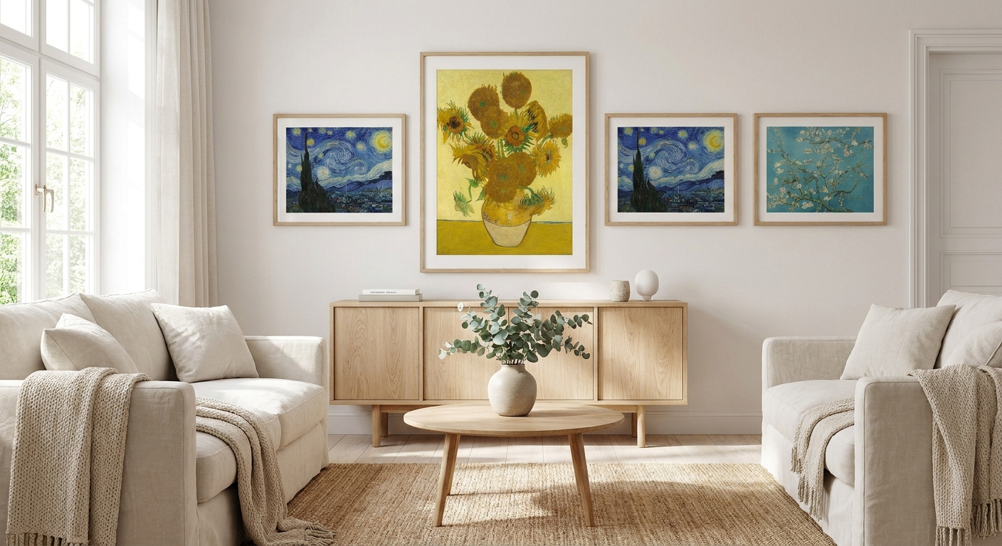
Van Gogh's brushwork is loud, saturated and full of movement — the near-opposite of Scandinavian restraint. Pick the right piece, though, and it sits inside a pale, wood-toned Scandi room without a fight. This guide narrows down which van gogh paintings actually work in a Nordic-leaning home in 2026, and which ones you should leave in the gallery gift shop.
- Almond Blossoms and Irises pair with Scandi palettes; Starry Night mostly fights them — Buy vs Skip.
- Van gogh paintings heavy on swirling cobalt and gold clash with a calm Scandi room unless the space has warm wood tones to anchor them.
- Light oak framing or an unframed canvas beats a gilt frame in a Scandinavian setting — matte finish reads better under natural light.
- A3 to A2 sizing suits Scandi's gallery-wall habit; a single oversized statement piece needs at least 1.8m of clear wall.
Why this matters
Scandinavian interiors run on restraint: pale oak, linen, one accent colour, lots of negative space. Van Gogh built a career on the opposite — thick impasto, complementary colour clashes, movement in every brushstroke. That tension is exactly why the wrong print looks like a mistake and the right one looks intentional.
Van Gogh completed roughly 2,100 works, including around 860 oil paintings, in a painting career that lasted barely a decade before his death in 1890. Only one sold while he was alive. That scarcity is part of why reproductions of his softer, pastel-led pieces — not the famous high-drama ones — have become the safer bet for calm, neutral rooms.
Who this is for
This guide is for anyone furnishing a Scandi, Japandi or Nordic-minimalist room who wants a recognisable masterpiece on the wall without it fighting the linen sofa and the light oak floor. If your room already leans warm and textured — think wool throws, ceramic vases, dried florals — you have more room to go bold than someone working with a stark white, all-grey palette.
Gioia Wall Art's curated print collection covers this exact tension between statement art and calm interiors, which is where most of the picks below start.
What to look for in van gogh paintings for a Scandi room
Palette restraint over colour intensity
Scandinavian rooms are built on a narrow palette — white, oak, grey, maybe one muted blue or sage. A print heavy on cobalt-and-gold contrast will dominate a room built for calm, so palette match matters more than the painting's fame.
Print medium: canvas, framed paper or poster
A canvas print reads softer and more textural, closer to the original's brushwork, while a framed paper print gives a crisper, more graphic look that suits a Scandi gallery wall. Posters work for rental rooms but lose texture at larger sizes.
Frame finish
Gilt and ornate frames read baroque, not Nordic. Light oak, raw timber or a thin black steel frame — or no frame at all on a gallery-wrap canvas — keeps the piece inside the Scandi language instead of fighting it.
Scale relative to negative space
Scandi rooms rely on empty wall as much as the art itself. A print sized too small looks like an afterthought; one sized too large without at least 1.8m of clear wall around it crowds a room built on breathing room.
Texture reproduction
Van Gogh's impasto is part of the appeal. A giclee print on canvas holds brushstroke texture far better than a flat poster print, which matters if you're hanging the piece at eye level in a living room rather than a hallway.
Room warmth
A cooler, all-white Scandi room needs a pastel, low-contrast piece. A warmer Scandi-with-wood room — more Japandi than Nordic-white — can carry a bolder, higher-contrast piece like a wheatfield or café scene.
Top picks for Scandi interiors
Almond Blossoms (1890) — the safe pick. Pale blue background, single blossoming branch, almost no colour clash. It was painted to celebrate a birth in the family, which makes it a natural fit for a nursery or reading nook in a Scandi home. Verdict: Buy.
Irises — the quiet pick. Muted green and violet against a soft ochre ground, low contrast, minimal visual noise. Works framed in light oak or as an unframed canvas over a sideboard. Verdict: Buy.
Wheatfield with Cypresses — the layered pick. Warm ochre fields against cobalt sky, more colour movement than Almond Blossoms but still earth-toned. Needs a warmer, wood-heavy Scandi room to land — a stark white room will make the ochre feel out of place. Verdict: Consider.
Café Terrace at Night — the bold pick. Deep indigo sky against warm yellow lamplight, genuinely striking as a single accent piece. Works as the one bold moment in an otherwise neutral room, not as one of several pieces on a gallery wall. Verdict: Consider for an accent wall.
The Starry Night — the wildcard. Swirling cobalt and gold across the entire canvas, high contrast, impossible to make quiet. Gorgeous in a room with warm timber and layered texture; overwhelming in a stark white minimalist space. Verdict: Skip for true Scandi-white, Consider for warm Japandi.
For a sense of how another Post-Impressionist palette handles the same brief, Claude Monet prints for Hamptons-style homes run softer and cooler — useful if even Almond Blossoms feels like too much colour for your room. And if you want a more graphic, single-colour-field alternative in the same modern-home spirit, Georgia O'Keeffe prints for modern homes sit at the calmer end of the same buying logic.
What to avoid
- Gilt or ornate baroque frames — instantly reads as traditional/European, not Nordic, no matter how good the print quality is.
- Starry Night as the sole statement piece in a small room — the swirl pattern needs distance to breathe; in a tight room it reads as busy rather than dramatic.
- Glossy laminate finish — Scandi rooms lean on big windows and soft natural light, and a glossy finish throws glare exactly where you want a calm focal point.
Verdict comparison
| Pick | Palette fit | Best room type | Frame recommendation | Verdict |
|---|---|---|---|---|
| Almond Blossoms | Pastel blue, low contrast | Nursery, reading nook | Light oak or unframed | Buy |
| Irises | Muted green/violet | Living room, hallway | Light oak, thin black steel | Buy |
| Wheatfield with Cypresses | Warm ochre, medium contrast | Warm/Japandi living space | Raw timber | Consider |
| Café Terrace at Night | Indigo/gold, high contrast | Accent wall only | Thin black frame | Consider |
| The Starry Night | Cobalt/gold, very high contrast | Warm textured rooms only | Light oak, generous mat | Skip for stark white |
FAQ
Are van gogh paintings a good fit for Scandinavian interiors?
Yes, if you pick the pastel, low-contrast works. Almond Blossoms and Irises sit comfortably in a Scandi room, while The Starry Night is generally too high-contrast for a stark white minimalist space.
What's the best van gogh painting for a small Scandi apartment?
Almond Blossoms is the best fit for a small space in 2026 because its pale blue background and single branch motif don't crowd a room the way a busier composition does.
Is Starry Night too bold for a minimalist home?
For a stark all-white Scandi room, yes — the swirling cobalt and gold dominate the space. In a warmer, wood-heavy Japandi room with more texture, it can work as a single statement piece.
What size van gogh print works best in a Scandi living room?
A3 to A2 suits Scandi's gallery-wall habit and layered look. A single oversized statement piece needs roughly 1.8m of clear wall around it to avoid crowding the room.
Should I choose a framed print or a canvas for a Van Gogh reproduction?
Canvas holds Van Gogh's impasto texture better and reads softer in a Scandi room, while a framed paper print gives a crisper, more graphic look suited to a gallery wall.
What frame finish works best for Van Gogh prints in a Nordic-style room?
Light oak, raw timber or a thin black steel frame keep the print inside the Scandi visual language. Gilt or ornate frames read baroque and clash with the rest of the room.
How many van gogh paintings did the artist actually create?
Van Gogh completed roughly 2,100 works, including around 860 oil paintings, across a painting career that lasted barely a decade before his death in 1890.
Can I mix a Van Gogh print with other artists in a gallery wall?
Yes, as long as the palettes match. Pairing Almond Blossoms with a muted Monet or O'Keeffe piece keeps the wall cohesive; pairing it with a high-contrast Starry Night print often creates visual competition.
One last thing
Almond Blossoms wasn't painted as a decorative piece at all — Van Gogh made it as a gift to celebrate his newborn nephew in 1890, months before his death. That's part of why it reads so calm compared to his other work: it was painted with warmth in mind, not drama, which is exactly the quality that makes it work in a Scandi room built on the same instinct.


