
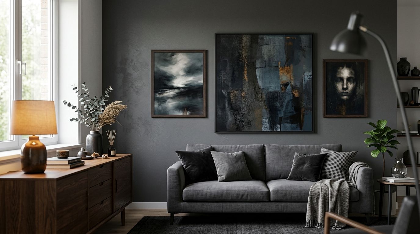
Dark and moody wall art for a contemporary living room means canvas prints, framed pieces or original paintings in charcoal, ink black, deep emerald or burgundy that add depth to a modern space without making it feel smaller. The right choice depends on how much natural light the room gets, how open the floor plan is, and whether the walls are already doing a lot of visual work — a piece that reads as striking in a north-facing room can go flat and gloomy in a dim one.
- Dark moody wall art suits contemporary living rooms with at least one strong natural light source in 2026.
- Charcoal, ink navy, forest green and burgundy canvas prints add depth without visually shrinking an open-plan room.
- One oversized statement piece beats several small dark prints in rooms under 25 square metres.
- Rothko-style abstracts and black-and-white photography are the safest resale-friendly dark picks for 2026 interiors.
Why dark moody wall art matters for contemporary living rooms
A contemporary living room is usually the room with the most competing demands: it needs to feel open during the day, cosy at night, and photograph well for the rest of the house to follow its lead. Dark and moody wall art does the heavy lifting other decor can't — it grounds a large blank wall, gives an open-plan space a visual anchor, and reads as considered rather than empty.
The risk is real too. A room with limited natural light and a dark sofa can tip into cave territory with the wrong piece above it — which is exactly why above-sofa styling needs its own scale and placement rules before you touch tone. Get the size, finish and light interaction right, and dark wall art in 2026 living rooms reads as designer-led, not dim.
How to choose dark and moody wall art for your living room
Audit your light before you commit to dark tones
Do this before you shop, not after the print arrives.
- Note which direction the main living room window faces — north and east-facing rooms in Australia handle darker tones better than south-facing ones
- Count how many hours of direct sun the feature wall gets between 10am and 4pm
- Check what the room looks like after dark under your current lighting, not just in daylight photos
- Hold a dark fabric swatch or printed sample against the wall for 48 hours across different weather
- Rule out the darkest corner of the room as a hanging spot if it already needs a lamp on at midday
Pick your dominant dark tone first
Dark doesn't mean one colour — it's a family, and each one behaves differently on a wall.
- Charcoal and warm greys read as neutral and pair with almost any sofa colour
- Ink navy softens a stark white room without the flatness of true black
- Forest and bottle green bring warmth and work well with timber floors
- Burgundy and deep terracotta suit rooms already leaning warm-toned
- True matte black is the highest-contrast option and needs the most light to avoid looking like a void
Black-and-white photography and monochrome abstracts are the lowest-risk entry point if you're nervous about commitment — see black and white wall art for a monochrome home for how that palette holds up against different wall colours.
Choose the right scale for your wall
Undersized dark art is the single most common failure in this category — a small dark print on a large wall reads as a hole, not a feature.
- Measure the full wall width and aim to cover 60-75% of it with the artwork or arrangement
- For a sofa wall, the piece (or grouped set) should run roughly two-thirds the width of the sofa
- Leave 15-20cm between the top of the sofa and the bottom of the frame
- In open-plan rooms, size up rather than down — a piece that looks large in the store often reads correctly-sized once it's on a big wall
- Group two or three dark pieces only if they share the same frame style and colour family
Match the finish to your room's mood
Canvas, framed print, unframed print and original painting all carry dark tones differently, and this is where the manual scoping above turns into an actual purchase decision. A raw canvas print absorbs light and deepens the tone further, which suits rooms that already get strong sun. A framed print under glass reflects some light back, which helps darker corners feel less flat. Gioia Wall Art's curated canvas and framed print range covers both finishes across the charcoal, navy and emerald tones described above, which shortcuts the trial-and-error most people do by hanging a mid-tone piece first and regretting it within a season.
Layer texture and light around the piece
Dark wall art rarely fails because of the art — it fails because of what's (or isn't) happening around it.
- Add a picture light or adjustable spotlight angled at 30 degrees to avoid glare and washout
- Bring in one warm-toned lamp nearby rather than relying only on overhead downlights
- Pair the piece with at least one textured element — a boucle cushion, a timber console, a woven throw
- Avoid placing dark art directly opposite a large uncovered window that creates harsh backlighting
- If the wall gets very little natural light, budget for the lighting fix before the art, not after
How to light wall art properly at home covers fixture types and placement angles for this exact problem.
Test placement before you hang anything
- Tape a paper cutout at the intended size and height and live with it for a few days
- Look at the wall at 7am, midday and after dark before deciding
- Photograph the mock-up on your phone — cameras often expose lighting problems the eye misses
- Walk the main sightline into the room (from the entry or kitchen) and check the piece reads from there, not just from the sofa
“If the wall doesn't get direct light for at least four hours a day, skip solid black and go for charcoal or deep emerald instead.”
Style the rest of the room to support the dark piece
A dark statement wall works best when the room around it isn't fighting it for attention — keep floors, sofas and window treatments in the same tonal family so the art stays the focal point rather than one dark thing among several.
Comparison: dark and moody wall art formats for living rooms
| Option | Best for | Key limitation | Verdict |
|---|---|---|---|
| Canvas print | Rooms with strong natural light, textured contemporary schemes | Absorbs light, can look flat in dim corners | Buy for bright rooms |
| Framed print | Darker rooms needing reflected light | Glass can glare under downlights | Buy with picture light |
| Unframed print (custom framing) | Buyers wanting a specific frame finish | Extra cost and lead time for framing | Hold until frame sourced |
| Original painting | A true one-off statement piece | Limited sizing and stock per artwork | Buy if the size fits first |
| Peel-and-stick wallpaper | An entire dark accent wall rather than a single piece | Full wall commitment, harder to swap out | Hold for renters |
Common mistakes in contemporary living rooms
- Going full matte black in a low-light room — the piece disappears into the wall by evening instead of standing out
- Sizing the art to the frame budget instead of the wall — a technically nice piece that's 40cm wide on a 3m wall reads as an afterthought
- Skipping the lighting fix — buying the art before checking whether the wall gets any usable light at all
- Mixing warm dark tones with cool grey sofas — burgundy and forest green need warm-toned furniture and timber to land, not cool concrete-grey schemes
- Hanging dark art directly opposite a mirror or glass door — the reflection doubles the contrast and makes the room feel busier, not calmer
FAQ
What is the best dark moody wall art for a contemporary living room in 2026?
Charcoal or ink navy canvas prints in an oversized format are the safest dark moody choice for most contemporary living rooms in 2026, since they read as intentional without needing a very bright room. Black-and-white photography is the next safest option if you want contrast without full colour commitment.
Is dark wall art bad for a small living room?
Dark wall art works in a small living room if the room gets direct natural light for part of the day and the piece is scaled up rather than down. A small dark print in a small room reads as a hole in the wall, not a feature.
Should dark wall art go above the sofa or on a different wall?
Above the sofa is the most common placement because it's the largest sightline in most living rooms, but a dark piece works just as well on an entry-facing wall if that's where the room's main view lands. The deciding factor is which wall gets seen first when someone walks in, not which wall is biggest.
What colour sofa goes with dark moody wall art?
Neutral, warm-toned sofas in linen, boucle or leather pair most easily with dark wall art, since the contrast sits in the art rather than competing with a bold sofa colour. A charcoal or navy sofa under a dark piece can work but needs strong lighting to avoid the whole wall reading as flat.
Does dark wall art make a room feel smaller?
Dark wall art only shrinks a room when it's undersized or the room lacks light — sized correctly in a well-lit space, it adds depth rather than closing the room in. The size-to-wall ratio matters more than the darkness of the tone itself.
Canvas or framed print for a dark statement wall?
Canvas suits rooms with strong natural light because the raw texture deepens the tone further, while a framed print under glass reflects some light back and suits darker corners. Choose based on how much light the specific wall gets, not personal preference alone.
How big should dark wall art be above a sofa?
Dark wall art above a sofa should run roughly two-thirds the width of the sofa, with 15-20cm of clearance between the sofa top and the frame's bottom edge. Undersizing is the most common mistake with this placement.
One last thing
The rooms where dark moody wall art fails almost always share one trait: the lighting was never checked before the art went up. Fix the light source first — even a single well-placed picture light — and the exact same charcoal or emerald canvas that looked flat in the store will read as intentional on the wall.


