
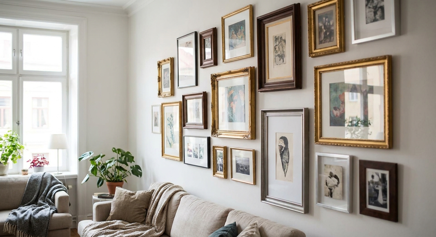
Mismatched frames only look intentional when something ties them together - this guide breaks down exactly how to mix frame styles on a wall without it looking like a garage sale wall.
- Mixing frame styles on a wall works when one element - colour, wood tone, or mat width - repeats across every frame.
- A 60/40 split of matching-to-mismatched frames reads more curated than a fully random layout in 2026 gallery walls.
- Start with your largest piece and build outward in a triangle, never a straight line.
- Original paintings and framed prints hang together fine if frame widths sit within 1cm of each other.
- Cap it at three frame finishes per wall - four or more reads cluttered, not collected.
Why this matters
A wall of identical black frames is safe, but it's also forgettable - and it's the first thing that makes a room look like a display at Gioia rather than a home someone actually lives in. Mismatched frame walls are what interior stylists reach for when a space needs personality without a full redecorate.
The problem is that "mismatched" and "messy" are one bad decision apart. Most failed attempts at mixing frame styles on a wall skip the one rule that makes it work: repetition of a single unifying detail, even while everything else varies.
What you'll need
- 5-9 pieces of wall art - a mix of framed prints, unframed canvas, and one original painting if you have one
- A tape measure and a roll of painter's tape
- Butcher paper or old newspaper for templating (optional but saves wall holes)
- A spirit level - phone apps work but a physical level is faster for more than four frames
- Picture hooks rated for the actual weight of each piece, not just the lightest one
- 60-90 minutes for a wall of 6-8 pieces
The steps
1. Pick your anchor piece first
Every mismatched wall needs one dominant piece that the eye lands on before it wanders - usually the largest or the most saturated in colour. This becomes your visual anchor and everything else gets arranged in relation to it.
Measure the wall and the anchor piece before you commit. A wall under 1.8m wide can usually only support one anchor over 60cm; anything bigger and the composition tips over. The common mistake here is picking the anchor last, after smaller pieces are already up - you end up rearranging everything.
2. Choose your one repeating element
Before frames go up, decide what's staying consistent: frame colour, wood tone, mat colour, or spacing. Pick exactly one. If three of your seven frames are natural oak, natural oak is your thread - the rest can be black, white, or unframed canvas, and it will still read as a set.
A 60/40 or 70/30 split between matching and contrasting frames tends to photograph better than an even 50/50, based on how most curated gallery walls at Gioia Wall Art get styled for customers in 2026. The mistake to avoid: changing frame colour, mat width, and spacing all at once - that's three variables competing for attention.
3. Template the layout on the floor first
Lay every piece out on the floor in the arrangement you're considering, in the exact spacing you plan to use on the wall. This costs ten minutes and saves you six nail holes.
Use 5-8cm of spacing between frames for a tight gallery cluster, or 10-15cm for a looser, more breathable spread. If you're combining canvas (no visible frame edge) with framed prints, add an extra 2-3cm around the canvas pieces - unframed edges read as "floating" and need more air to avoid looking cramped. For a full walkthrough of spacing ratios and triangle-versus-grid layouts, the gallery wall layout guide covers it in more depth than this section can.
4. Trace the layout onto paper and tape it up
Trace each frame's outline onto butcher paper, cut it out, and tape the paper templates to the wall using painter's tape. Step back ten feet and look at it from across the room, not up close.
This step catches the mistake most people only notice after drilling: an anchor piece that's technically centred on the wall but visually off-centre because of furniture below it (a sofa arm, a console table edge). Adjust the paper templates until the composition feels balanced relative to the furniture, not just the wall dimensions.
5. Hang the anchor piece at eye level
The centre of your anchor piece should sit around 145-150cm from the floor - true museum-height eye level. Every other piece gets positioned relative to this one, not to the wall's centre point.
Use two hooks for anything over 40cm wide to stop the piece drifting off-level over time. This is also the point where an original painting earns its place: a single textured, hand-painted piece as the anchor gives the rest of the wall something to visually orbit that a print alone won't provide.
6. Fill outward, checking sightlines every 2-3 pieces
Work outward from the anchor in a loose triangle or diamond shape rather than left-to-right rows - rows read as a matched set even when the frames themselves don't match, which defeats the point of mixing styles deliberately.
Step back after every 2-3 additions. If your eye keeps snagging on one spot before reaching the anchor, that piece is competing for attention and needs to move further from centre or come down entirely.
7. Do a final frame-width check
Stand at the doorway and look at the wall as a whole. Frame widths within about 1cm of each other read as intentional even in different colours or finishes; anything wider than a 2cm gap between the thinnest and thickest frame starts to look accidental.
Swap out any frame that's visually too heavy or too thin for the group before you call it finished.


Troubleshooting
The wall looks cluttered instead of curated. You likely have more than three frame finishes running at once. Pull one finish out entirely - usually the odd metallic or ornate frame - and the rest will settle into a cohesive group.
One piece keeps pulling the eye away from the anchor. Move it further from the centre of the composition, or swap it for something smaller. High-contrast black-and-white pieces are the usual culprits since they read louder than colour work from across a room.
The layout looked fine on paper but feels off on the wall. Paper templates don't account for wall texture, light direction, or nearby furniture shadows. Re-check the arrangement at the time of day the room gets used most, not when you happened to be templating.
Frames of different depths make the wall look uneven from the side. Deep box frames and thin poster frames sitting side by side cast different shadows. Group similar depths together within the same cluster rather than alternating them piece by piece.
The wall feels top-heavy or bottom-heavy. Recount your visual weight, not your piece count - one large dark canvas can outweigh three small light frames. Redistribute so the heaviest 1-2 pieces sit near the vertical centre of the group.
Nail holes don't line up after adjustments. This is why the paper-template step matters - skip it and you'll patch more holes than you hang frames.
Tools and resources
- Painter's tape and butcher paper for templating before you drill
- A stud finder if any piece exceeds 3kg
- Framed prints for gallery walls for pre-framed pieces that already sit within a consistent width range
- Picture-hanging strips for lightweight, unframed pieces under 1kg
- A laser level for walls with more than six pieces, where a bubble level gets slow
What to do next
Once the frame styles are settled, sizing is the next variable that makes or breaks the wall - a composition can have perfect colour balance and still feel wrong if the scale is off for the space. The guide on choosing the right size wall art for your wall walks through the ratios that keep a mismatched layout from feeling either too small or too dominant for the room.
FAQ
How many different frame styles can you mix on one wall?
Two to three frame finishes is the workable range for most walls in 2026 - beyond that, the eye starts reading the wall as unplanned rather than curated. Keep one consistent element, like wood tone or mat width, across all of them.
Do frames need to match to look good together?
No - frames don't need to match as long as they share one consistent detail such as colour, width, or finish. A mix of black, oak, and white frames works fine when the mat colour or spacing stays uniform throughout.
Can you hang an unframed canvas next to a framed print?
Yes, unframed canvas and framed prints hang together well when you add slightly more spacing, around 2-3cm extra, around the unframed piece so its edge doesn't feel cramped against a framed neighbour.
What's the best layout shape for mismatched frames?
A loose triangle or diamond built outward from one anchor piece reads more intentional than straight rows, which tend to visually group even mismatched frames into a rigid set.
How do you stop a mismatched wall from looking cluttered?
Cap the number of frame finishes at three and template the full layout on paper before drilling. Clutter usually comes from too many competing finishes rather than too many pieces.
Should the biggest piece go in the centre or off to one side?
The biggest piece works best as the anchor near the visual centre of the composition, hung at roughly 145-150cm to the centre point, with smaller pieces built outward from it.
Can an original painting work in a mismatched gallery wall?
Yes - an original painting makes a strong anchor piece precisely because its texture and colour depth give the rest of the wall something distinct to orbit visually, more so than a print alone.
How much spacing should be between mismatched frames?
5-8cm works for a tight cluster and 10-15cm for a looser spread; unframed canvas pieces need an extra 2-3cm on top of that to avoid looking cramped next to framed neighbours.
One last thing
The detail most people miss: frame width matters more than frame colour. Two frames in completely different finishes but the same 2cm profile width will read as a set faster than two frames in the same black finish but different widths - measure profile width before you measure anything else.


