
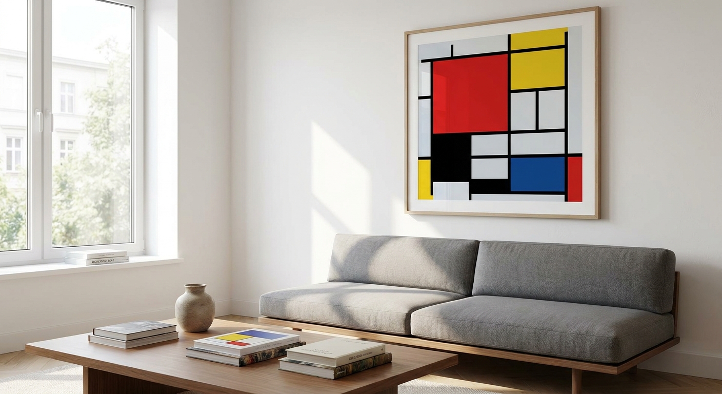
Piet Mondrian's grid-and-primary-colour compositions are the fastest way to turn a plain room into a genuine modern statement, and geometric interiors reward that kind of graphic confidence. This guide breaks down what actually matters when you're choosing mondrian prints for a real Australian home in 2026, not a gallery wall in a design magazine.
- Mondrian prints work best in rooms with clean lines and neutral bases — Scandinavian and minimalist interiors, not busy eclectic ones.
- Canvas holds saturated primary red, yellow and blue better than paper prints over a 2026 print run.
- A 90cm-plus print reads as a graphic anchor; anything under 50cm looks like a poster, not a statement piece.
- Thin black metal or no frame keeps the grid lines crisp — ornate timber frames fight the composition.
- Buy for open-plan living and home offices, consider for staircases, skip oversized versions in small rental rooms.
Why this matters
Mondrian died in 1944, and Australia's copyright term runs 70 years past an artist's death — so reproduction of his grid works has been legal here since 2015, which is exactly why mondrian prints have become a staple category rather than a niche one. The 1917 De Stijl movement he helped found built its whole identity on horizontal and vertical lines, primary colour blocks and off-centre balance, and that same visual language is what makes these prints such a clean fit for modern geometric rooms in 2026.
The problem isn't finding a Mondrian print. It's finding one sized, framed and finished for your actual wall instead of a stock photo of a white gallery. Get the minimalist home styling basics wrong and a $150 print looks like a poster from a dorm room, not a design choice.
Who this is for
This is for anyone furnishing a room with a Scandinavian, Japandi or straight-up minimalist base — white walls, timber floors, low-clutter furniture — who wants one piece of art to carry the whole colour story. It's also for renters and apartment owners who want a bold, gallery-grade look without committing to an entire room renovation. If your space already leans Hamptons or Coastal Luxe with soft blues and driftwood tones, a Mondrian grid will fight the palette rather than complete it.
What to look for in Mondrian prints for geometric interiors
Colour-block accuracy
Mondrian's compositions rely on a handful of saturated primaries — red, yellow, blue — set against white and black grid lines, and a washed-out reproduction kills the effect instantly. Cheap prints often shift the red toward orange or the blue toward navy under low-quality ink, which flattens the contrast the whole style depends on. In a geometric interior where the art is doing most of the colour work, accuracy isn't optional.
Line sharpness and print medium
The grid is the composition — soft or blurred black lines read as a mistake, not a style choice. Canvas prints with a tight weave hold a crisp edge better than budget paper stock, especially at larger sizes where any waver in the line becomes obvious from across the room. This is one area where paying for a better print medium changes the finished look more than almost any other decision.
Scale relative to the wall
A Mondrian grid needs room to breathe — undersized, it looks like a poster; oversized on a small wall, the blocks lose their proportion to each other. As a working rule, aim for a print that covers 60-75% of the available wall width above furniture, which on a standard 2.4m Australian living room wall usually lands somewhere between 90cm and 130cm wide.
Frame style
A thin black metal frame or a raw canvas edge keeps the graphic quality intact. Anything with visible grain, gold leaf or a wide mat board competes with the primary colour blocks and pulls focus away from the grid itself — the opposite of what a geometric interior wants.
Palette coordination with the room
Mondrian's reds, yellows and blues need at least one echo elsewhere in the room — a cushion, a rug edge, a lamp base — or the print reads as an isolated accent rather than a considered piece. Rooms with an all-neutral base (grey, white, black, timber) are the easiest match because the print supplies 100% of the colour.
Top picks by room
The graphic anchor — open-plan living and dining A large-format grid composition (100cm-plus) works as the single focal point in open-plan spaces where sightlines run long. One spec that matters here: choose a piece with at least three distinct colour blocks so it reads clearly from 4-5 metres away, the typical viewing distance in an open-plan layout. Check canvas prints for open-plan living spaces for sizing that suits combined living zones. Buy.
The quiet desk companion — home offices A mid-size print (60-80cm) behind a desk brings structure without visual noise during video calls, which matters more in 2026 than it did five years ago. Look for a composition with more white space than colour blocks — it reads as calm rather than busy on camera. See wall art for home offices for desk-height placement guidance. Buy.
The vertical run — staircases A sequence of two or three smaller Mondrian-style grids stepping up a stairwell turns a functional space into a gallery moment, provided each piece shares the same black-line weight so the run feels unified rather than mismatched. Reference wall art for staircases before you commit to spacing and height. Consider — staircases have tighter sightline distances, so oversized single pieces don't work here the way they do in open living areas.
The rental-friendly nod — share houses and small apartments A compact print (40-50cm) in a lightweight frame gives you the geometric look without the commitment, and it's easy to move between rentals. In a small apartment, though, a single oversized grid can overwhelm the whole room instead of anchoring it. Consider for a compact piece, Skip anything over 90cm in a room under 20 square metres.
What to avoid
- Pastel "Mondrian-inspired" abstracts that soften the primaries into blush and sage — they lose the contrast that makes the style recognisable in the first place.
- Ornate gold or heavily textured frames — they fight the clean grid instead of framing it.
- Undersized prints on feature walls — anything under 50cm on a wall wider than 3m reads as an afterthought, not a statement.
Verdict comparison
| Pick | Best room | Size sweet spot | Frame | Verdict |
|---|---|---|---|---|
| Graphic anchor | Open-plan living/dining | 100cm+ | Thin black or raw canvas | Buy |
| Quiet desk companion | Home office | 60-80cm | Thin black frame | Buy |
| Vertical run | Staircase | 40-60cm each, run of 2-3 | Matching black frames | Consider |
| Rental-friendly nod | Share house/small apartment | 40-50cm | Lightweight or unframed | Consider/Skip over 90cm |
FAQ
What is a Mondrian print exactly?
A Mondrian print is a reproduction of Piet Mondrian's grid-based compositions using black lines, white space and blocks of primary red, yellow and blue. The style comes from the 1917 De Stijl movement he co-founded.
Are Mondrian prints legal to reproduce in Australia?
Yes. Mondrian died in 1944 and Australian copyright runs 70 years past an artist's death, so reproduction of his work has been public domain here since 2015.
What size Mondrian print suits a living room wall?
For most Australian living rooms, aim for a print covering 60-75% of the wall width above the furniture, typically 90-130cm on a standard 2.4m wall in 2026.
Framed or unframed for a Mondrian-style print?
A thin black metal frame or raw canvas edge keeps the grid lines sharp. A heavy or ornate frame competes with the composition and dulls the graphic effect.
How much does a Mondrian print cost in 2026?
Prices vary by size, medium and framing, so check current listings for exact figures rather than relying on a fixed number.
Do Mondrian prints suit small apartments?
A compact print (40-50cm) works well in small rooms, but anything over 90cm in a space under 20 square metres tends to overwhelm rather than anchor the room.
Which room works best for a Mondrian print?
Open-plan living and dining areas suit large-format Mondrian prints best because the long sightlines let the full composition read clearly from across the room.
Canvas or paper print for geometric lines?
Canvas with a tight weave holds sharper black grid lines than budget paper stock, which matters most at larger sizes where any waver becomes visible.
One last thing
The detail most people miss: Mondrian never centred his colour blocks, and neither should your print selection. If a "Mondrian-style" piece has perfectly symmetrical squares, it's a decorator knockoff, not a faithful reproduction — the off-centre balance is the whole point of the composition.
“If the colour blocks in a Mondrian print are perfectly centred, it's not a faithful reproduction.”
Gioia Wall Art's approach to wall art curation treats a Mondrian grid the same as any other statement piece — size it to the wall, match the frame to the room's finish level, and let the primary colours do the rest of the work. Gioia's wall art range covers the sizing range this style needs, from desk-height pieces to full feature-wall formats.


