
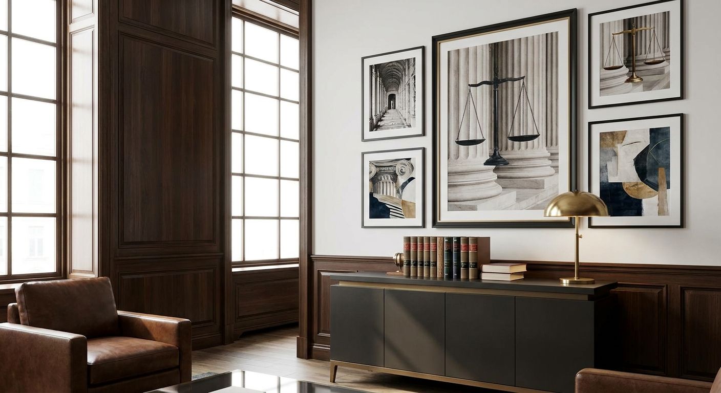
A law firm office has one job for its walls: back up the trust a client is already extending to hire you. Wall art for a law firm office needs to read as considered and calm, not decorated as an afterthought between the photocopier and the filing cabinets.
- Wall art for a law firm office should skew abstract and muted — Opaline ($1,500) is a Buy for reception desks and smaller partner offices.
- Taking Time ($1,400) at 101 x 101cm suits boardroom feature walls where one large piece beats a cluster of small frames.
- Through the Visible / Visible Through IV ($4,500) is a Consider for a signature partner office wanting a genuine statement piece.
- Skip motivational typography and bright pop art in meeting rooms — both read as start-up, not established practice, in 2026.
Why this matters
Clients spend most of their visit sitting still: in reception, in a corridor, in a meeting room waiting for a partner to arrive. Whatever hangs on that wall gets studied longer than almost anything else in the building, which makes it a quiet extension of the firm's brand.
Get it wrong and the mismatch is obvious fast — a stock inspirational quote print next to a confidentiality agreement undercuts the seriousness of the room. Get it right and nobody notices the art, they just feel like they're in competent hands.
Who this is for
This guide is for office managers, practice managers and partners furnishing reception areas, meeting rooms, corridors and private offices at a legal practice — solo practitioners fitting out a single suite through to multi-partner firms with several floors. If you're decorating a shared corporate office space rather than a client-facing legal practice, the brief shifts slightly toward energy and collaboration instead of gravity, but the sizing and framing logic below still applies.
What to look for in wall art for a law firm office
Scale that matches boardroom and reception walls
A single small print on a large boardroom wall looks like it was forgotten there. Measure the wall and aim for a piece that fills roughly 60-70% of the available width above furniture — for a typical 3-4 metre boardroom wall that usually means one large canvas around 100-150cm wide rather than three small ones.
A palette that reads as calm authority, not clinical
White walls plus grey furniture plus a stark black-and-white print can tip a room from professional into cold. Warmer neutrals, muted blues, or earthy abstracts soften the room without introducing anything a client would call distracting during a difficult conversation.
Framing that controls glare under office lighting
Most legal offices run fluorescent or LED downlights that bounce hard off glossy glass. Unframed canvas or matte-finished framed prints handle overhead lighting far better than glazed prints in a meeting room where someone is sitting directly opposite the wall for an hour.
Content that stays neutral across a diverse client base
Family law, criminal defence and estate practices in particular see clients on the worst day of their lives. Landscape, abstract and botanical work travels safely across that range; anything political, religious or aggressively graphic does not belong in a shared client space.
Durability for high-traffic corridors and reception
Reception walls and corridors get bumped, brushed past, and exposed to more daylight than a private office. Original paintings on stretched, varnished canvas — like the pieces below — hold up better here than lightweight paper posters, which show wear within a year or two of foot traffic.
Consistency across multiple floors or offices
A firm with several partner offices or more than one location benefits from picking a loose palette or artist style once and repeating the logic floor to floor, rather than letting each office pick whatever they like. It reads as one firm, not five different tastes stapled together.
Top picks for a law firm office
Opaline — the quiet anchor. Mixed media on canvas, 61cm (W) x 51cm (H) x 3.8cm (D), signed on the front, sold at $1,500. The scale suits a reception desk wall or a smaller partner office without overwhelming the room. Verdict: Buy for entry lobbies and single-partner suites. View Opaline.
Taking Time — the boardroom statement. Acrylic on canvas, 101 x 101cm, sold unframed at $1,400, signed on the back. A square format this large fills a boardroom feature wall with one piece instead of a cluttered gallery arrangement. Verdict: Buy for the main meeting room where clients sit facing it for the length of a negotiation. View Taking Time.
Through the Visible / Visible Through IV — the wildcard. Original artwork exploring fragmented, translucent overlapping imagery, priced at $4,500. It's the most expensive pick here and the most memorable — the kind of piece a client mentions after the meeting. Verdict: Consider for a signature partner office or a firm's flagship reception, not for every conference room on every floor. View Through the Visible / Visible Through IV.
Memories of the Bush — the local touch. Acrylic abstract inspired by the Queensland ranges, priced at $2,710, unframed on stretched canvas. It gives an Australian sense of place without resorting to a literal gum tree photograph, which tends to read as generic rather than intentional. Verdict: Buy for firms wanting a regional identity in reception without going kitsch.


If a bigger budget isn't in scope this year, browse framed prints for a lower entry point that still reads as considered rather than off-the-shelf.
What to avoid
- Motivational typography and quote art. "Hustle" and "Dream Big" prints belong in a start-up open-plan office, not next to a partnership agreement. It undercuts the seriousness clients are paying for.
- Bright, saturated pop art in meeting rooms. It's the right energy for a creative agency and the wrong one for a room where someone is discussing a dispute or a will. Save bold colour for a staff kitchen or break room instead.
- Stark high-contrast black-and-white photography throughout the whole floor. One monochrome piece in reception reads sharp; monochrome on every wall reads like a hospital corridor, not a law firm.
Verdict comparison
| Pick | Best for | Size | Price | Verdict |
|---|---|---|---|---|
| Opaline | Reception, small offices | 61 x 51cm | $1,500 | Buy |
| Taking Time | Boardroom feature wall | 101 x 101cm | $1,400 | Buy |
| Through the Visible / Visible Through IV | Signature partner office | Large abstract | $4,500 | Consider |
| Memories of the Bush | Regional identity in reception | Large landscape abstract | $2,710 | Buy |
FAQ
What size wall art works for a law firm reception desk?
Aim for one piece filling 60-70% of the wall width above the desk — for a standard reception wall that's usually a single canvas between 90cm and 130cm wide rather than several small frames.
Is abstract art better than photography for legal offices?
Abstract and landscape work is generally safer than photography in a law office because it stays neutral across a wide range of clients, while photography of people or specific scenes can read as too personal or divisive for a shared space.
Should law firm wall art be framed or unframed?
Both work, but matte-finished framed prints or varnished stretched canvas handle office lighting glare better than glazed glass in a meeting room. Unframed canvas is also lower-maintenance in high-traffic corridors.
How much does wall art for a law firm office cost in 2026?
Original paintings suited to a legal office typically run from roughly $1,400 to $4,500 depending on size and artist, while framed prints offer a lower entry point for firms furnishing multiple rooms on a set budget.
Can original paintings work in a law office, or should firms stick to prints?
Original paintings work well in reception and partner offices where you want one standout piece, while prints make more sense for corridors and smaller meeting rooms where you're furnishing several walls at once.
What colours work best for a professional law office palette?
Muted neutrals, warm earth tones and soft blues read as calm authority without feeling cold. Reserve stark black-and-white or bright primary colours for a single accent piece rather than the whole floor.
Is typography or quote art appropriate for legal offices?
Generally no. Motivational quote prints read as start-up culture rather than an established practice and sit awkwardly next to formal client-facing work.
Do all offices on multiple floors need matching wall art?
They don't need to match exactly, but repeating a palette or artist style across floors makes a multi-partner firm read as one cohesive practice rather than several offices with unrelated taste.
One last thing
The wall most law firms forget is the corridor between reception and the meeting room — the one clients walk down while their nerves are highest and the one that usually stays bare because reception got all the attention and budget. A single well-placed piece there does more for a client's first impression than a second statement piece in a boardroom nobody's waiting in.


