
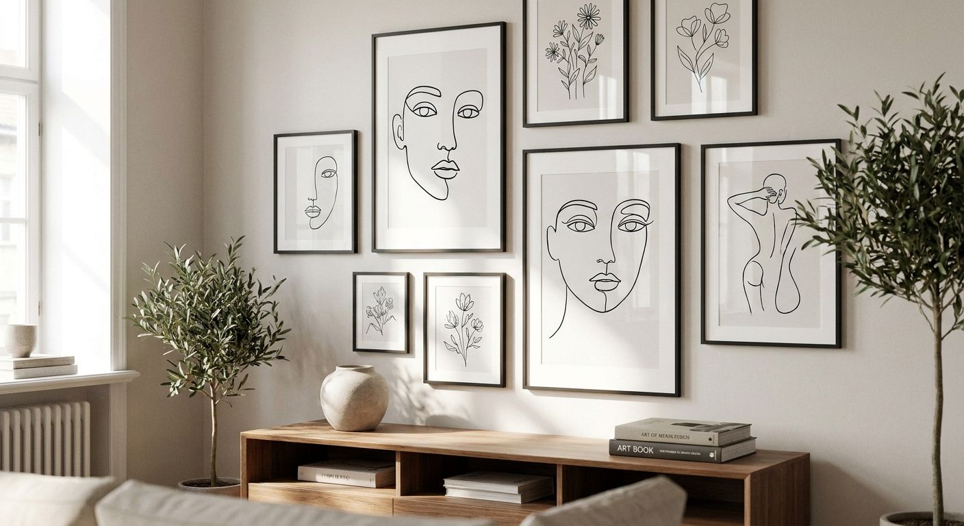
Line art prints for a modern gallery wall are single-continuous-line or minimal-line illustrations, hung in a multi-piece set to build one cohesive feature wall rather than a single statement piece. A gallery wall built around line art needs consistency across line weight, palette and frame style so the collection reads as one composition, not six unrelated prints competing for attention.
- Line art prints work best in gallery walls when line weight, palette and frame family stay consistent across every piece.
- Mix one bolder or textured print with 3-5 line art pieces so the wall doesn't go flat.
- Map the layout on the floor or with paper templates before any nail goes in.
- Piet Mondrian's grid-based line work and Henri Matisse's continuous-line drawings are the two reference points most modern gallery walls pull from.
- Gioia Wall Art's curated line art and framed prints give you a matched-format starting point for 2026 gallery wall builds.
Why line art prints matter for a modern gallery wall
A modern gallery wall lives or dies on restraint, and line art is the easiest category to over-collect and under-plan. Where a botanical print or a landscape canvas can stand alone, line art prints are built to be read as a set: the individual piece is deliberately simple so the arrangement does the visual work.
This is also why line art has stayed a fixture in Scandinavian, Japandi and minimalist interior styling through 2026 — the format scales down to apartment walls and up to double-height hallways without needing a different design language. Gioia Wall Art curates line art alongside canvas, framed and unframed prints specifically because gallery wall shoppers rarely buy one piece; they buy a plan.
The reference points are well established in art history. Henri Matisse's late-career line drawings reduced the human figure to a single continuous stroke, and Pablo Picasso's 1949 dove sketches did the same with animals — both are the direct ancestors of the single-line prints filling gallery walls now. Piet Mondrian's grid compositions from the 1920s and 1930s sit at the other end of the same category: geometric line art built from hard right angles instead of a loose continuous stroke. Knowing which lineage a print comes from is the fastest way to keep a gallery wall from looking like a random print sale.
Define your line weight and palette first
Before you buy a single print, decide whether your wall is going loose-continuous-line or hard-geometric-line — mixing both without a plan is the single most common reason a gallery wall looks cluttered instead of curated.
- Pick one line weight (thin, medium, or bold) and stick to it across every print in the set
- Choose a two-color palette maximum: black-on-white, or black-on-white plus one accent
- Decide whether gold, terracotta or sage accents run through the set, or whether it stays strictly monochrome
- Photograph your existing furniture and floor tones before shopping so the line art doesn't clash with the room
- Rule out warm-toned frames if your palette is cool, and vice versa
Choose a size hierarchy before you buy
A modern gallery wall needs a hierarchy — one hero size, one mid size, one small size — repeated across the set so the eye has a resting point.
- Set one hero print at roughly 60-70% of the width of the furniture piece below it
- Use 2-3 mid-size prints to flank or stack around the hero
- Add 1-2 small prints only as connective tissue, never as the anchor
- Measure the total wall width and height before ordering, not after
- Leave equal gaps (usually 5-10cm) between every frame in the set
Pick a frame family that unifies the set
Mismatched frames are the second-biggest reason a line art gallery wall reads as messy rather than curated — the print matters less than the frame consistency around it.
- Stick to one frame finish across the whole wall: black, natural timber, or white
- Match frame width (thin gallery frames vs. box frames) across every piece
- If budget allows framing later, buy unframed art prints for custom framing and frame the whole set in one batch
- Avoid mixing glossy and matte finishes in the same cluster
- Test one framed sample against the wall colour before committing to the full set
Map the layout before you drill
Gallery wall layouts fail more often from poor planning than poor print choice. Trace every frame onto kraft paper, tape the shapes to the wall, and live with the layout for a day before you touch a drill.
- Lay the paper templates on the floor first to test spacing
- Tape templates to the wall and check sightlines from the couch or doorway
- Use a laser level for anything wider than three frames
- Leave the arrangement taped up for 24 hours before committing
- Read a gallery wall layout guide if the wall is asymmetric or has a window or switch plate breaking the space
Balance line art with one textured or solid piece
A wall built entirely from thin line art can go flat under downlights. One denser or more textured piece — a solid abstract, a deeper-toned botanical, or a canvas with visible texture — gives the eye somewhere to land.
- Add one canvas print with visible texture or brushwork among the flat line prints
- Use a darker or bolder line-art piece as the visual anchor instead of a busy pattern
- Keep the textured piece in the same palette family so it doesn't fight the set
- Limit texture pieces to one per 4-6 line art prints
Shop the line art prints that match your plan
Once the palette, sizing and frame family are locked, buying gets fast — this is where a curated storefront beats scrolling marketplace listings one at a time.
- Filter by palette and line style rather than browsing everything
- Check that print sizes match the hierarchy you mapped on the wall
- Buy framed prints for gallery walls as a set where possible, so frame finish stays consistent
- Order one print first if you're unsure, then build out the rest of the set once it's hung
Line art styles compared
| Line art style | Best for | Format | Key limitation |
|---|---|---|---|
| Single-line continuous | Minimalist, Scandi-leaning rooms | Unframed or thin black frame | Reads flat without a bolder anchor piece nearby |
| Botanical line drawings | Japandi and warm-neutral interiors | Framed, mid-to-large sizes | Needs matched print stock or the whites clash |
| Figurative/portrait line art | Bedrooms, reading nooks | Framed, smaller formats | Can skew gallery-cold if overused across a whole home |
| Geometric, Mondrian-style | Bold modern or Art Deco interiors | Large canvas or box frame | Strong colour blocks can fight softer line pieces on the same wall |
Verdict: for a first modern gallery wall in 2026, single-line continuous prints in one palette give the most forgiving starting point — they scale, they pair with almost any frame finish, and they don't demand a second anchor piece straight away.
Common mistakes on a line art gallery wall
- Mixing loose and geometric line styles without a bridge piece — a Matisse-style continuous line next to a Mondrian-style grid, with nothing connecting them, looks accidental rather than curated
- Buying frames one at a time as prints arrive — finishes drift subtly between orders and the mismatch only shows once the whole set is on the wall
- Skipping the paper-template stage — drilling straight from a mental picture is the single most common cause of uneven gaps and crooked rows
- Sizing the hero print to the wall instead of the furniture below it — a print sized to the wall alone often overwhelms the room once furniture is back in place
- Treating line art as a filler category — buying the cheapest, most generic prints because "it's just line art" produces a wall that looks thin instead of intentional
FAQ
What is line art in interior design?
Line art is illustration reduced to continuous or minimal strokes with little to no shading or colour fill. In gallery walls it works because the simplicity lets multiple prints sit together without visual competition.
How many line art prints do I need for a gallery wall?
Most modern gallery walls use 5-9 prints in one hero, mid and small size hierarchy. Fewer than 5 tends to look sparse, and beyond 9 the layout usually needs a second wall.
Should line art prints be framed or unframed for a gallery wall?
Framed prints give a more finished, uniform look straight out of the box, while unframed prints let you batch-frame the whole set in one matching finish. Either works as long as every piece in the set matches.
Can I mix line art with photography or botanical prints on the same wall?
Yes, as long as the palette stays consistent — a black-and-white line art set can absorb one botanical or photographic piece if it shares the same tonal range. Mixing bright colour photography into a monochrome line art wall usually breaks the composition.
What size line art print works above a sofa or bed?
For a single hero print, aim for roughly 60-70% of the furniture's width below it. In a gallery wall arrangement, the combined width of the cluster should hit that same proportion instead of any single print.
Is black and white line art better than coloured line art for a modern home?
Black and white line art is more forgiving across different wall colours and furniture tones, which is why it dominates modern and minimalist gallery walls. Coloured line art works when the accent colour already exists elsewhere in the room, such as cushions or a rug.
How do I hang a line art gallery wall without damaging rental walls?
Paper templates plus removable picture hooks or strips let you plan and hang a full set without patching multiple nail holes. Test the layout on paper first since line art gallery walls are the hardest style to re-space once holes are already in the wall.
One last thing
The fastest way to check if a line art gallery wall will work before you buy anything is to convert your palette and size plan into black-and-white photocopies at the actual print sizes and tape them up first — it exposes spacing and hierarchy problems that a mental picture never catches, and it costs nothing to fix at that stage.


