
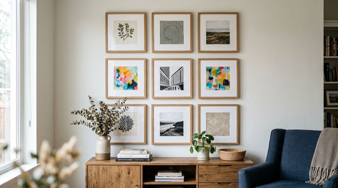
Square wall art gives gallery wall builders a fixed 1:1 grid module to design around, so a mix of rectangular prints, portraits and posters stops fighting for space on the same wall. Builders planning a gallery wall in 2026 look for square formats specifically because a square panel keeps its silhouette no matter which row or column it lands in, while rectangles force awkward gaps at the grid's edges.
- Square wall art works as the repeatable anchor unit for a balanced gallery wall because its 1:1 ratio holds its shape across any row or column.
- A single 60cm x 60cm square canvas centered mid-wall can carry a gallery wall of five to nine smaller pieces without visual competition.
- Leave 5-8cm between frames for a cohesive grid in 2026 gallery wall layouts; tighter reads cluttered, wider reads disconnected.
- Odd-numbered groupings of square pieces, five, seven or nine, read more balanced than even counts because the eye can't split them evenly.
Why square wall art matters for a gallery wall
Gallery wall builders searching for square wall art in 2026 aren't shopping for one statement piece, they're shopping for a repeatable module. A rectangular canvas locks you into a single orientation; rotate it and the silhouette changes. A square canvas doesn't have that problem, so a 40cm square print reads the same whether it sits top-left or bottom-right in the grid.
That flexibility matters most in the two most requested gallery wall styles right now: the even grid and the symmetrical salon wall, both covered in more detail in Gioia Wall Art's gallery wall layout guide. Both layouts need visual weight to land evenly across the wall, and square wall art is the easiest shape to repeat without the eye catching an inconsistency.
Square wall art is the safest starting format for anyone building a gallery wall from scratch in 2026, because it removes orientation as a variable you have to solve for.
“A square panel keeps its silhouette no matter which row or column it lands in, while a rectangle forces awkward gaps at the grid's edges.”
How to build a gallery wall around square wall art
1. Measure your wall before you pick a single piece
Start with the tape measure, not the catalogue. Square wall art still needs to fit real wall dimensions, and gallery walls that skip this step end up either crowded or lost in empty space.
- Measure the full width of the wall and mark roughly 60-70% of that width as your gallery wall's outer boundary, the proportion most gallery wall layouts use to avoid crowding the corners.
- Measure from the top of any furniture below (sofa, console, bed) and leave 20-25cm of clearance before the bottom row of square frames starts.
- Note fixed obstacles, light switches, vents, door swings, that square wall art has to work around, since a square grid can't bend around a switch plate the way one large rectangle can.
- Photograph the blank wall and sketch the boundary directly on the photo before buying anything.
2. Pick one grid pattern and commit to it
A gallery wall built from square wall art only works if the underlying pattern stays consistent from the first frame to the last.
- Even grid: equal-width rows and columns, easiest pattern to fill with equal-size square panels, best for a calm, ordered wall.
- Salon wall: a looser cluster of varied sizes anchored by one or two larger squares, best for movement without full symmetry.
- Symmetrical mirror: identical square pieces mirrored left and right of a centre point, best for hallways and staircases seen from both directions.
- Pick one pattern before you shop, mixing patterns mid-wall is the fastest way to make a square-heavy gallery wall look accidental.
3. Choose a format mix that keeps squares dominant
Square wall art doesn't have to mean an entire wall of only squares, but it should make up the majority of the panels or the grid loses its anchor.
- Aim for square pieces across 60-70% of the wall's total panel count, with the rest as rectangular accents.
- Match frame depth and matting width across every square piece in the grid, a deep-set frame next to a flush one breaks the illusion of a single module.
- If you're piecing the wall together over several orders, shop from one range so colour and print finish stay consistent, Gioia Wall Art's framed prints for gallery walls collection is built around this kind of matched sizing, the faster route once you've settled on a grid pattern.
- Keep at least one plain, low-detail square in the mix as a visual rest stop between busier pieces.
4. Balance colour and negative space across every panel
Square panels sit closer together than a single large rectangle, so colour clashes are harder to hide once the wall is up.
- Repeat at least one colour across three or more panels so the eye has an anchor to travel between.
- Alternate busy prints with quieter, single-tone squares, a wall of nine equally detailed pieces reads as noise, not art.
- Leave visible negative space inside at least a third of the square panels themselves, not just between the frames.
- Test the full colour spread against the wall colour before hanging anything.
5. Anchor the wall with one oversized square centrepiece
Every balanced gallery wall needs one piece the eye lands on first.
- Choose one square piece at roughly double the size of the surrounding panels to act as the visual anchor.
- Position the anchor at eye level, roughly 145-150cm from the floor to its centre, the standard gallery-height guideline most framers use.
- Build the grid outward from the anchor in both directions, keeping spacing identical on every side.
- Offset the anchor slightly left or right of dead-centre, an anchor that isn't perfectly centred reads more intentional than one that is.
6. Dry-fit the layout on paper or the floor first
Skipping this step is the single most common reason gallery walls get redone within a year.
- Trace each square frame onto kraft paper at true size and tape the shapes to the wall before hanging a single piece.
- Alternatively, lay the full grid out on the floor using the same spacing you plan to use on the wall.
- Photograph the dry-fit from across the room, spacing errors that look fine up close often show up in a wide shot.
- Adjust gaps until every row and column measures the same distance apart, then mark nail points through the paper.
7. Hang with consistent spacing and a level
- Keep gaps between square frames at 5-8cm across the entire wall, tighter reads cluttered, wider reads disconnected.
- Hang the anchor piece first, then work outward row by row.
- Use a level on every piece, square frames show a crooked hang more obviously than rectangles because there's no long edge to disguise the tilt.
- Use two hanging points per frame on anything over 40cm square to stop the piece rotating out of line.
8. Maintain the wall as your collection grows
- Add new square pieces in matched multiples, two or four at a time, rather than one at a time, so the grid stays even.
- Re-check spacing every time a piece is added or swapped, one new frame at the wrong gap throws off the whole row.
- Rotate seasonal or lower-priority pieces out rather than adding extra rows that break the boundary you measured in step one.
Square wall art formats compared
| Option | Best for | Key limitation |
|---|---|---|
| Square canvas print | Grid and salon walls needing a seamless, frameless module | Canvas edges show wear faster in humid rooms |
| Framed square print | Symmetrical walls where sharp, glazed edges matter | Glass glare can wash out detail under direct light |
| Square poster, unframed | Renters building a temporary gallery wall | Corners curl over time without a frame or mount |
| Original square painting | One anchor piece inside an otherwise print-based grid | Texture and brushwork vary piece to piece, so colour-matching takes more care |
For most gallery walls, framed square prints win on consistency, canvas wins on a frameless modern look, and posters win on flexibility for renters who might move the wall next year.
Common mistakes gallery wall builders make with square art
- Buying one giant square print and surrounding it with only rectangles, which defeats the point of a repeatable grid.
- Using inconsistent gaps, 5cm in one row, 15cm in the next, which reads as uneven even when each individual piece is level.
- Filling an entire wall with only squares and zero variation in tone or busyness, which flattens the wall into one grey block from across the room.
- Skipping the paper dry-fit and eyeballing frame positions directly on the wall, which usually leaves extra nail holes once the spacing is redone.
- Mixing frame depths and matting widths from different square print runs, which breaks the seamless-module effect square wall art is meant to deliver.
FAQ
What is square wall art best for?
Square wall art is best for gallery walls and grid layouts where every piece needs to repeat cleanly without changing orientation. It also suits small spaces like hallways where a symmetrical mirror layout needs identical panels on each side.
Is square wall art better than rectangular for a gallery wall?
Square wall art works better than rectangular pieces for grid and salon-style gallery walls because a 1:1 ratio holds its shape in any row or column. Rectangular pieces still add useful variation as accents, but a wall built entirely from mismatched rectangles is harder to keep visually even.
How many square pieces do you need for a gallery wall?
Most gallery walls built around square wall art use five to nine pieces, since odd numbers read more balanced than even counts. A wall wider than 2 metres can extend to eleven or thirteen pieces without losing the grid's structure.
What size square wall art works as a gallery wall centrepiece?
A centrepiece roughly double the size of the surrounding panels, commonly 60cm x 60cm against 30cm x 30cm satellites, anchors a gallery wall without overpowering it. Hang the centre of that piece at 145-150cm from the floor, the standard gallery-height guideline.
Can you mix square and rectangular wall art on one wall?
Yes, keep square pieces at roughly 60-70% of the panel count and use rectangles as accents rather than the majority. Going much lower than that ratio starts to undercut the grid consistency square wall art is meant to provide.
How much space should you leave between square prints?
Leave 5-8cm of gap between square frames on a gallery wall; tighter spacing reads cluttered and wider spacing reads disconnected. Keep the gap identical across every row and column, not just between adjacent pieces.
Framed or canvas square wall art for a gallery wall?
Framed square prints hold sharper edges and suit symmetrical layouts, while canvas gives a frameless, seamless module for grid and salon walls. Choose canvas for a modern, minimal wall and framed prints when the room already has other framed elements to match.
One last thing
Odd-numbered groupings, five, seven, nine square pieces, read more balanced on a gallery wall than even counts, because the eye can't split them into two competing halves. If the grid you've planned lands on an even number, add or drop one small square panel before you hang anything in 2026 rather than after.


