
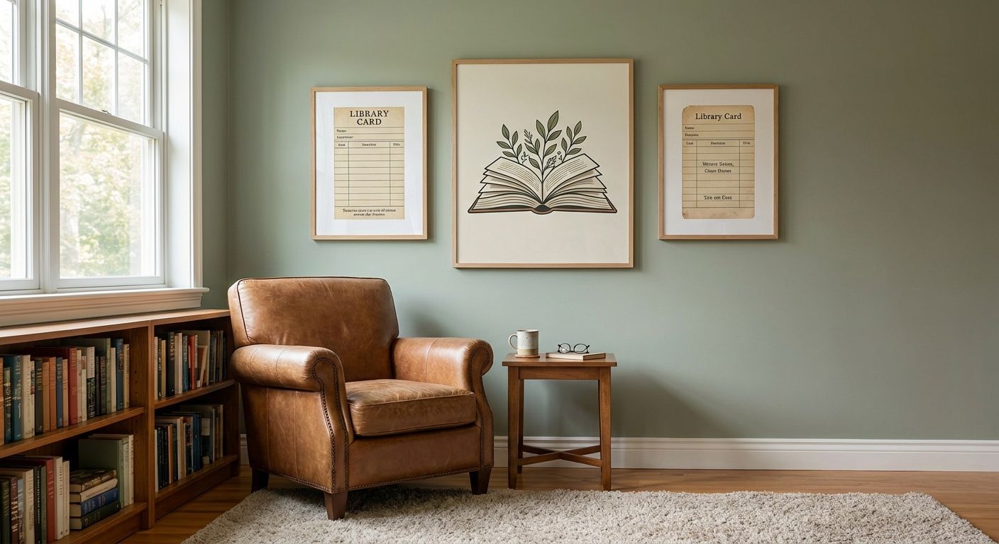
Floor-to-ceiling shelving does most of the visual work in a home library, which means the wall art around it has one job: complement the spines without turning the room into a gallery that happens to have books in it.
- Wall art for home libraries should read as quiet, not competing with spine colour or shelf lines.
- Typography and literary quote prints from Gioia Wall Art suit reading nooks better than bold abstracts.
- Original paintings under 1000mm wide fit library alcoves without crowding built-ins.
- Framed prints handle dust and lamp glare better than raw unframed paper in a working library.
- Skip glossy oversized canvases in home libraries — glare off a reading lamp ruins the piece.
Why this matters
A home library is a working room, not a display room. The wall art in it competes with spine colour, warm lamp light, and often a reading chair angled at 45 degrees to the shelf run.
Get the scale or the subject wrong and the art either disappears next to the books or fights them for attention. Get it right and the room reads as intentional — the kind of space people photograph, not just use.
Who this is for
This guide is for anyone building out a reading corner, a full home library, or a study lined with built-in shelving in a home renovated or bought in 2026. It applies whether the room holds 40 paperbacks or a floor-to-ceiling collection, and whether the shelving is a single alcove or a full wall.
If your walls are mostly bookcase and your remaining hanging space is a narrow strip above a reading nook chair or a chimney breast between two shelf runs, the sizing and subject rules below matter more than they would in an open living room.
What to look for in wall art for home libraries
Scale that respects the shelving, not competes with it
Most home library wall space is leftover space — the gap above a doorway, the strip beside a window, the panel between two bookcases. Measure that gap before you shop, because a piece sized for an open lounge wall will look stranded next to dense shelving.
As a rule, the art should occupy 60-75% of the available gap width, which for a typical 900mm alcove means a print in the 500-700mm range works, not a 1200mm statement canvas. Check the sizing logic in right size wall art guide before ordering.
Colour that reads against spines, not blends into them
Book spines create their own colour field, usually warm and busy if the collection spans decades of publishing design. Wall art in the same tonal range as the spines vanishes into the noise; art with one strong contrasting note — a deep terracotta, a cool blue, a single black-and-white piece — anchors the eye instead.
Neutral or monochrome prints tend to work harder in a library than saturated colour blocks, because they don't compete with the spine palette for attention.
Subject matter that rewards a slow read
Libraries are rooms people sit in for long stretches, so the art gets looked at more than in a hallway you pass through in three seconds. Landscapes, botanical studies, and literary typography hold up to repeat viewing better than trend-driven graphic prints that feel dated by 2027.
Quote prints and typography pieces are a natural fit here — a well-chosen line of text reads as considered rather than gimmicky in a room full of text already.
Framing that survives dust and lamp glare
Libraries collect dust from paper and cloth binding faster than most rooms, and reading lamps throw direct light across nearby walls. Framed prints under glass wipe clean in seconds and cut glare better than raw unframed paper pinned straight to plaster.
If you're building out more than one piece in the room, look at how a full gallery wall framing approach handles mixed frame widths — it matters more in a library than in a single-statement-piece room because you're usually working around irregular shelf gaps.
Placement that doesn't fight the ladder or reading chair
If the library has a rolling ladder, factor its swing radius into where art hangs — nothing kills a considered room faster than a print clipped by a ladder rail on day one. Chair-side placement should sit at seated eye level, roughly 100-110cm from the floor, not standard 145cm gallery height, because most library viewing happens from a seated position.
Top picks for home library walls


The literary anchor. Typography and quote prints are the safest opening move in any library, because the room already runs on text. Choose one line, not a full paragraph — a single sentence at 600mm wide holds attention better than a busy quote block. Browse the quote wall art range for options that suit a study or reading nook. Buy.
The quiet original. Memories of the Bush at $2,710 is an acrylic abstract built around a muted Queensland palette, which reads as calm rather than loud against a wall of spines. One original piece like this does more for a library than three matching prints. Buy if the room has a single strong focal wall to give it.
The portrait pick. Woman In Elegant Hat at $179.99 works in the corner beside a reading chair where a landscape would feel too large. Portraiture in a smaller format suits the intimate scale of most library seating nooks. Consider for a chair-side wall under 700mm.
The abstract statement. Through the Visible / Visible Through IV at $4,500 is a layered, translucent abstract that suits a modern library with minimal shelving trim rather than heavy timber built-ins. It's a bigger spend, so reserve it for a genuine feature wall, not a filler gap. Buy for a statement wall; Skip for a small alcove.
What to avoid in a home library
- Glossy oversized canvases. Reading lamps throw direct light across nearby walls, and a high-gloss finish bounces that light straight back at the reader's eyes.
- Busy maximalist patterns. A wall of colourful spines is already a pattern. Stacking a second bold pattern on top of it reads as cluttered, not curated, by the time you've filled two bookcases.
- Unframed paper prints near humid corners. Australian homes without climate control in a converted sunroom or garage-library see enough moisture swing to warp raw paper over a year or two. Framed and glazed prints hold up better in those rooms.
Verdict comparison
| Criteria | Why it matters in a library | Buy signal |
|---|---|---|
| Scale | Fills 60-75% of shelf-gap width without crowding built-ins | Print sized to the actual alcove, not the room |
| Colour | Contrasts spine tones instead of blending in | One dominant neutral or muted tone |
| Subject | Holds up to slow, repeat viewing | Typography, landscape, or botanical over trend graphics |
| Framing | Resists dust and lamp glare | Framed and glazed over raw unframed paper |
| Placement | Works from a seated reading position | Hung at 100-110cm for chair-side walls |
“If you can read the title from across the room, the piece is too loud for a library.”
FAQ
What's the best wall art for home libraries?
Typography and quote prints, muted landscapes, and small original paintings work best because they hold up to slow, repeat viewing without competing with book spines. Oversized glossy canvases and busy patterned prints tend to clash with shelving in 2026-built home libraries.
Is a framed print better than an unframed print for a library?
Framed and glazed prints are better for libraries because they resist dust from paper and cloth binding and cut glare from reading lamps. Unframed prints suit low-traffic rooms more than a working reading room.
How big should wall art be above a bookcase?
Size the art to fill 60-75% of the available gap width above or beside the shelving, not the full wall. A 900mm alcove typically suits a print in the 500-700mm range.
What colour wall art suits a home library?
Neutral or muted tones work best because bright, saturated colour competes with the visual noise of book spines. One contrasting accent tone, rather than a full colour block, anchors the wall without overwhelming it.
Should I hang art at standard gallery height in a library?
No — standard gallery height (around 145cm) suits walking-past walls, not seated reading corners. For chair-side walls, hang art at 100-110cm so it sits at seated eye level.
Do quote prints work in a home library?
Yes, typography and literary quote prints suit libraries better than most rooms because the space already runs on text. One line at a considered size reads as intentional, not gimmicky.
Can original paintings work in a small reading nook?
A single original painting works better than several matching prints in a small nook, provided it's sized to the actual wall gap rather than a full feature wall. Smaller-format portraiture or still life suits tight chair-side corners.
One last thing
The cheapest fix in most home libraries isn't buying new art — it's re-hanging what's already there at seated eye level instead of standard gallery height. Most reading corners get decorated as if someone will view them standing up, and almost nobody does.


