
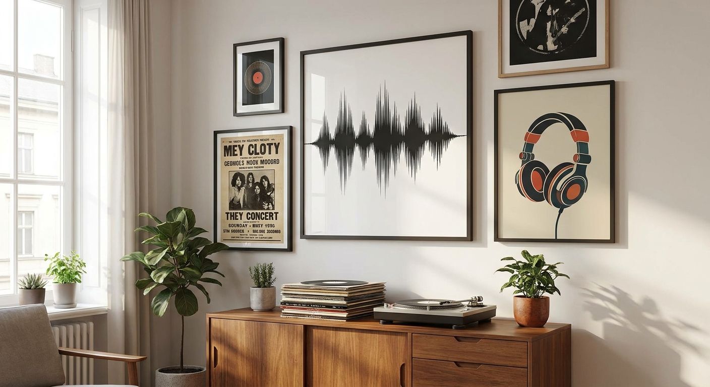
Vinyl collections deserve walls that look considered, not accidental — art that frames the ritual of pulling a record instead of competing with milk-crate shelving. This guide breaks down what actually works above a turntable console, in a listening nook, or across a share-house living room built around a growing collection.
- Typography and lyric prints suit music lovers who want personality without dating the room to one band — Buy for shared spaces.
- Bold pop-art portraits work as wall art for music lovers who treat their collection as a visual identity, not just sound.
- Framed prints beat raw posters near turntables in 2026 humidity-prone Australian homes — glass protects against handling dust.
- Gallery-wall layouts mixing 2-3 frame sizes read as curated, not cluttered, when hung above record shelving.
- Skip anything with a single artist's face printed large — it dates the room the moment tastes shift.
Why this matters
A record wall gets more foot traffic and more handling than almost any other feature wall in the house — people crouch at the shelf, flip through sleeves, lean in to read liner notes. The art above it needs to hold up to that kind of close, repeated attention, not just look good from the sofa.
Most generic "music wall art" defaults to guitar silhouettes or a single band poster, which works for a teenager's room and nowhere else. Wall art for music lovers in 2026 needs to read as a design choice first, a music reference second — that's the difference between a themed room and a styled one.
Who this is for
This guide is for vinyl collectors furnishing a dedicated listening corner, share-house tenants building a man cave around a turntable and speakers, and anyone hanging art above open record shelving in a living room or study. It assumes the collection itself is the visual anchor — the art needs to support that, not fight it for attention.
What to look for in wall art for music lovers
Scale that matches the shelving, not the wall
Record shelving is usually low and wide — a 90cm to 120cm run is typical for a two-shelf console. Art hung above it should span roughly 60-75% of that width, which usually lands you in the 60x90cm to 80x120cm canvas range rather than a single oversized statement piece.
A palette that survives sleeve rotation
Record sleeves swap in and out constantly — this week's stack might be all muted folk covers, next week loud 80s neon. Pick wall art in a palette that sits adjacent to most album art rather than matching one specific era, so the wall doesn't clash every time the rotation changes.
Framing built for a high-traffic zone
Listening corners collect dust, humidity from nearby kitchens, and the occasional knocked elbow while someone digs through crates. Framed prints under glass hold up far better here in 2026's variable Australian humidity than raw unframed posters, which curl and yellow faster in high-touch zones.
Subject matter with staying power
A single band's face or logo dates the room the moment your taste moves on — and vinyl collectors' tastes move constantly. Typography, abstract colour-blocking, or era-agnostic imagery age better than literal band merchandise blown up to canvas size.
Display flexibility for renters and share-housers
A large share of vinyl collectors are renters or share-house tenants who can't commit to permanent gallery walls. Unframed prints, peel-and-stick options, or lightweight framed pieces that can move apartment to apartment matter more here than in an owned-home context.
Top picks for a vinyl listening wall
The sentimental pick — lyric and quote typography prints. A single well-chosen line in bold type reads as personal without needing a specific artist's face on the wall. These work at almost any size from 40x50cm up to 100x140cm and pair naturally with typography and quote wall art sized for the space you've got. Verdict: Buy for anyone who wants personality without locking the room to one genre.
The collector's pick — a mixed gallery wall above the shelving. Combining 3-4 framed prints in varied sizes (say, one 50x70cm anchor piece with two 30x40cm supporting frames) mimics the visual rhythm of album covers stacked in a crate. Following a proper gallery wall layout keeps the spacing from looking accidental. Verdict: Buy if your collection already has visual variety you want to echo above it.
The bold pick — pop-art style portraits with heavy colour blocking. These lean into the visual energy of classic album art without reproducing an actual cover, which keeps things legally and aesthetically safer than framed record sleeves. They suit collectors whose taste skews toward 60s-80s pressings where the graphic design was as loud as the music. Verdict: Consider for a bolder room — Skip if your space already runs busy with equipment and cables.
The wildcard pick — a single oversized abstract piece instead of a gallery cluster. For collectors who want the wall to feel calm and let the shelving itself be the visual interest, one large abstract canvas in the 100x150cm range does more with less. It's the lower-maintenance option if you rearrange your shelving often. Verdict: Consider for minimalist listening rooms, Skip if you want the wall itself to tell a story.


“If the print competes with the record sleeves for attention, it's the wrong print for this wall.”
What to avoid
- Single-artist portrait prints blown up large. They look like merchandise, not decor, and they date the room the moment your listening habits shift.
- Glossy unframed posters near the turntable. Glare off unframed poster stock under overhead lighting makes text and imagery hard to read from a seated position, and the paper curls faster in humid Australian rooms.
- Neon-only palettes matched to one album era. They look sharp for exactly as long as that record stays on top of the pile, then clash with everything that follows.
Quick verdict comparison
| Pick | Best size range | Room fit | Verdict |
|---|---|---|---|
| Lyric typography print | 40x50cm - 100x140cm | Any listening corner | Buy |
| Mixed gallery wall | 3-4 frames, 30x40cm-50x70cm | Above open shelving | Buy |
| Pop-art portrait | 60x90cm | Bold, less cluttered rooms | Consider |
| Oversized abstract | 100x150cm | Minimalist setups | Consider |
FAQ
What's the best wall art for music lovers with a small vinyl collection?
A single mid-size typography or lyric print in the 40x50cm to 60x90cm range works best for a small collection, since it doesn't compete visually with a shelf that isn't yet full. Save the gallery-wall approach for once the collection grows past two shelves.
Is a gallery wall better than one large print above a record shelf?
A gallery wall suits collectors whose shelving already shows visual variety, since it echoes that mixed-crate look. A single large print suits minimalist setups where you want the shelving itself to be the focal point.
Should I frame posters for a vinyl listening room?
Yes, framing under glass protects against dust and handling in a high-traffic zone, and it holds up better in humid Australian conditions than raw unframed poster stock. Renters can still choose lightweight frames that move easily between apartments.
How much wall art should go above a record shelf?
Art should span roughly 60-75% of the shelf's width, which for a typical 90-120cm shelf run lands in the 60x90cm to 80x120cm range for a single piece, or a cluster of similar total width.
Does band merchandise count as wall art for music lovers?
It can, but a single band's face or logo dates the room quickly once tastes shift, whereas typography, abstract, or era-agnostic pieces stay relevant across changing rotations in 2026 and beyond.
What colour palette works best near vinyl shelving?
A neutral-to-warm palette that sits adjacent to most album art, rather than matching one specific era's colour trend, avoids clashing every time the record rotation changes.
Can renters hang framed art above a record shelf?
Yes, lightweight framed prints or peel-and-stick options suit renters who need art that moves easily between apartments without wall damage.
One last thing
The detail most collectors miss: hang the art at the eye level of someone crouching at the shelf, not someone standing across the room — that's the actual sightline this wall gets used from, and in 2026 that's still the single most overlooked measurement in a listening-corner setup.


